Agora
Building a Workspace Without Borders
The modern workforce doesn't recognize borders. A designer might start their day in Lagos, collaborate with a team in Lisbon, and deliver to clients in Bali. Yet workspace solutions remained frustratingly local, until Agora changed the equation.
Starting in Portugal's thriving startup ecosystem, Agora quickly realized its vision extended far beyond Lisbon. Within months of launch, demand emerged from unexpected corners: digital nomads in Mauritius seeking premium workspaces, Fintech entrepreneurs in Malta needing collaborative environments, tech startups in Nigeria requiring flexible solutions, and creative agencies in Indonesia looking for inspiring spaces.
Today, Agora operates across five countries, proving that great workspace experiences translate across cultures. We helped them build a brand that could scale globally while maintaining local relevance.
From strategic positioning to website design, we created a system that positions Agora as the premium choice for modern professionals.
Strategy, Brand Identity Design, Motion Design, Deck Design, Iconography, Website Design, Website Development

The idea
Where the world meets to work
The future of work isn't just remote, it's truly global. Agora represents the workspace as a universal language, where a startup founder in Mauritius can work with the same tools, aesthetic, and experience as their counterpart in Malta or Indonesia.
This isn't about creating identical spaces, it's about creating consistent excellence that adapts to local contexts. Whether you're navigating Nigeria's Fintech boom, Malta's blockchain sector, Indonesia's creative economy, or Mauritius's offshore services industry, Agora provides the familiar foundation that lets you focus on what matters: your work.

The brand
Future-forward foundation
We anchored Agora's visual identity in 2025's Pantone Color of the Year, ensuring the brand would feel current from launch. But color alone doesn't create differentiation. The full palette balances innovation with warmth, reflecting Agora's mission to be both cutting-edge and genuinely welcoming.
The type system strikes a careful balance: sophisticated enough for enterprise clients, approachable enough for freelancers. The typographic choice reinforces Agora's positioning as premium without being pretentious, essential for a brand serving everyone from students to scaling startups.


Physical Expression
Merch that stays on you
Agora's merchandise needed to transcend typical corporate swag. We designed pieces that members would genuinely want to wear—bold, dynamic designs that reflect Agora's vibrant culture while maintaining sophistication. The goal was creating brand ambassadors, not walking billboards.


The system
Global communication system
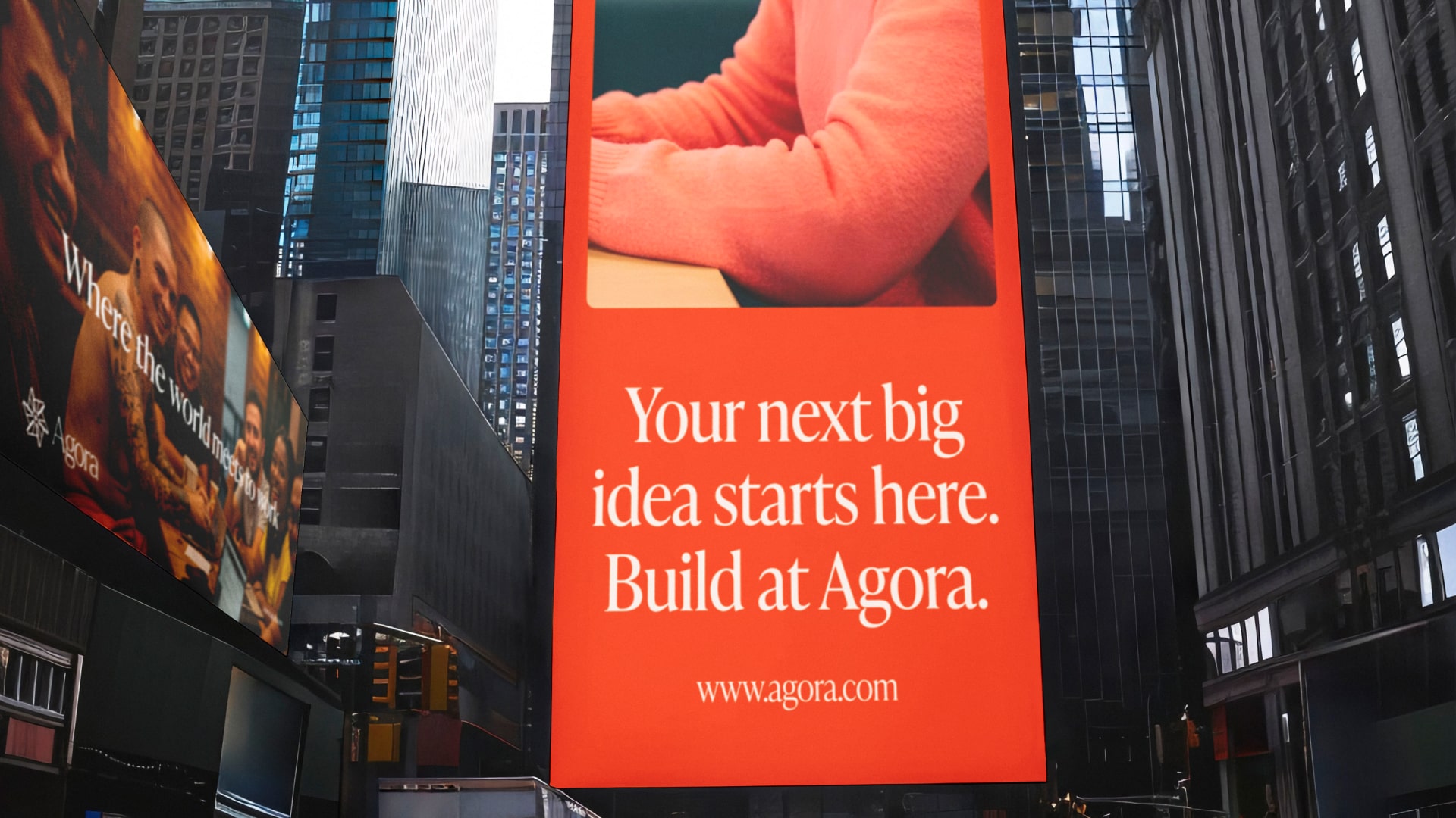
Clear and effective communication is essential for any brand with a strong message, and it becomes critical when operating across five countries. We designed a comprehensive communication system spanning both digital and out-of-home channels. Five interconnected billboard layouts provide flexible messaging that scales effortlessly across different formats and cultural contexts, while digital templates ensure consistent social media presence from Portugal to Nigeria.


The experience
Digital experience that converts
The website serves as an important conversion tool for Agora, designed to make workspace exploration intuitive and membership benefits crystal clear. Every design decision—from typography and navigation to layout and interaction—creates a seamless, welcoming experience that mirrors the physical spaces themselves.
The pitch deck extends the brand system into investor relations, presenting Agora's vision and market opportunity with the same sophistication and clarity that defines the member experience. Clean design and strategic information architecture help investors quickly understand both the business model and growth potential.

The strategic challenge
Building beyond borders
Most coworking brands think locally and expand incrementally. Agora faced a different challenge: how do you create a workspace brand that feels authentic in Lagos (Nigeria), Lisbon (Portugal), Gżira (Malta), Ebene (Mauritius), and Bali (Indonesia) simultaneously? Each market has distinct business cultures, design preferences, and professional expectations.
The brief
To build a premium brand identity that could scale across five countries and multiple cultures without losing its distinct character, while creating digital and physical experiences that feel relevant to both local entrepreneurs and an increasingly global community of professionals.
And ultimately, to build a brand that feels global without feeling distant, giving Agora a consistent identity while leaving room for each market to make it its own.
Our approach
Global foundation, local adaptation
We approached this challenge by building a brand system that operates like a global franchise model, with strong core principles and flexible application. The solution required three layers: a universal visual language that transcends cultural boundaries, adaptable components that flex to local market preferences, and consistent quality standards that ensure the Agora experience feels premium regardless of location.
The strategy was to create a brand architecture robust enough to maintain recognition across continents while sophisticated enough to feel native in each market. This meant designing systems, not just designs- frameworks that could evolve with each territory while maintaining unmistakable Agora DNA.
Impact
A global network that works
The brand system launched simultaneously across five markets, establishing Agora as the first truly global workspace brand designed from the ground up for international consistency.
Cross-border recognition: Members can walk into any Agora location worldwide and immediately feel at home, while the brand adapts to local market expectations and cultural nuances.
Market leadership: In each territory, Agora is positioned as the premium workspace choice for internationally-minded professionals.
Scalable excellence: The flexible brand system enables rapid expansion into new markets while maintaining the quality and consistency that define the Agora experience.
The result: A workspace brand that doesn't just offer desks, it provides a global passport for the modern workforce, proving that exceptional workspace experiences translate across continents and cultures.
Creative Direction, Brand & Motion Design
Paul Kelly
Typography
IvyPresto Headline via Adobe Fonts
View more projects