Mercurie

Accelerating African Economy
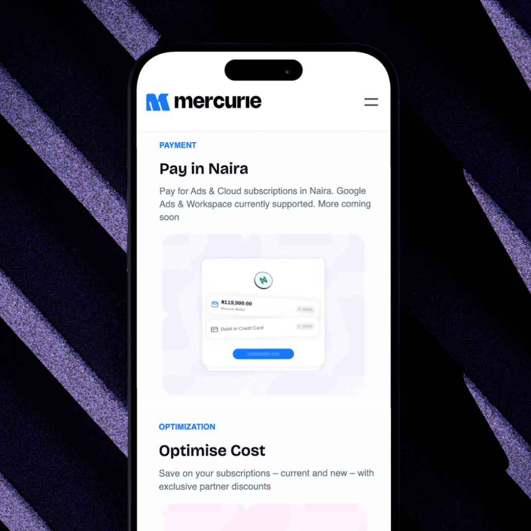
The year is 2024, and African businesses are powering their growth with global digital tools, yet paying for them remains a costly barrier. Currency conversion fees and volatile exchange rates turn every SaaS subscription into a financial gamble. In Nigeria alone, businesses lose millions annually to these hidden costs. Mercurie saw the opportunity to change this, launching with Adpay to let businesses pay for Google Ads in Naira. Success was immediate: over 2,000 businesses adopted the platform within months.
But rapid growth revealed a challenge. As Mercurie expanded from Adpay to SaaSpay and Cloudpay, its brand identity struggled to keep pace with its ambitions. What started as a single-product solution now needed to represent a comprehensive vision: Accelerating Africa's entire digital economy.
We helped them build that foundation.
Brand Strategy, Brand Identity, Iconography, Illustrations, Brand Guidelines
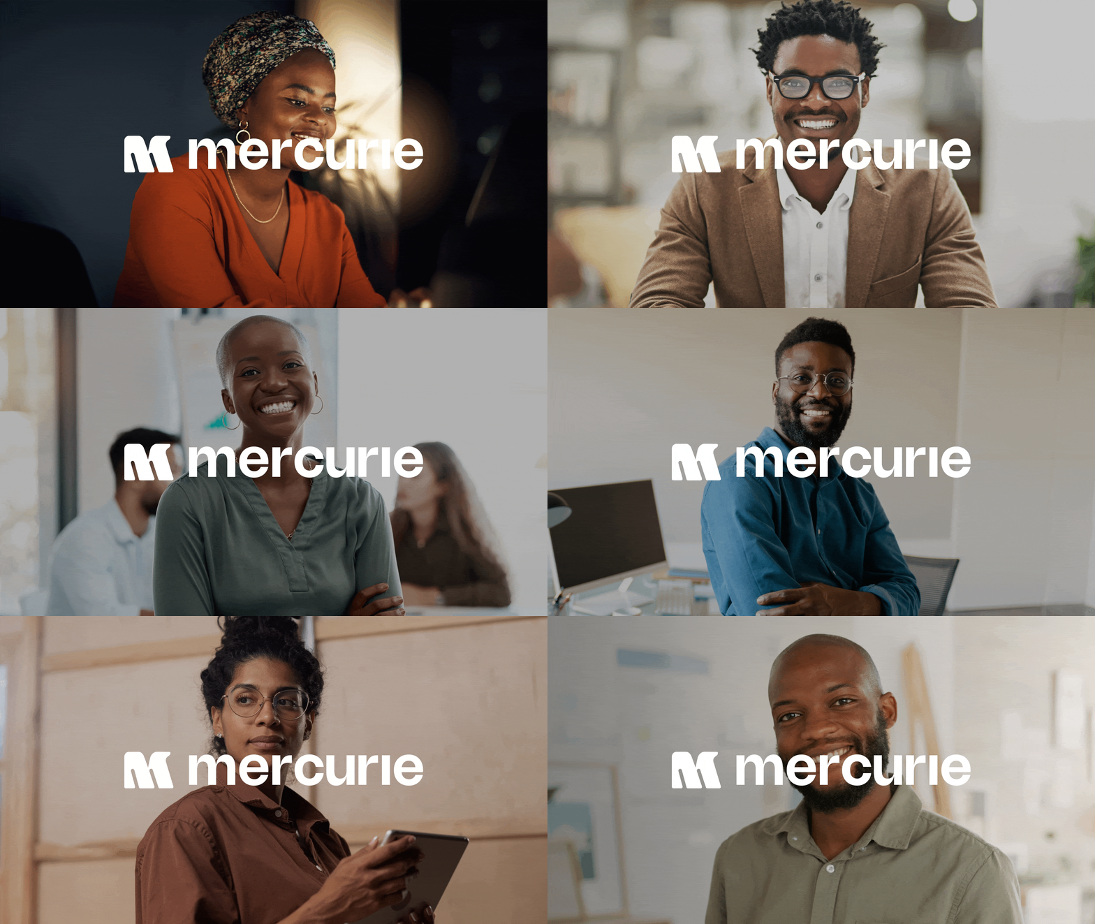
Do more with your local currency
The insight that shaped everything: African businesses shouldn't have to think in dollars to access global tools. Your local currency isn't a limitation; it's your competitive advantage. Mercurie transforms the Naira from a barrier into a bridge, enabling businesses to focus on growth instead of exchange rates.
This philosophy extends beyond payments. It's about economic sovereignty. When businesses can operate fully in their local currency, they're not just saving on conversion fees; they're participating in building a stronger local economy. Every transaction through Mercurie is a vote for Africa's digital independence.

The brand
Identity that commands trust
Authority meets approachability. The logomark needed to command respect in boardrooms while feeling accessible to growing businesses. Through iterative refinement, we achieved a symbol that balances Fintech credibility with Nigerian warmth—essential for a brand serving everyone from startups to established enterprises.
The palette celebrates Nigeria's currency heritage while projecting modern fintech sophistication. Bricolage Grotesque and Mona Sans create typographic tension that mirrors Mercurie's positioning: deeply local, globally ambitious. Every touchpoint reinforces this duality.

The system
An adaptive visual system
Static brands don't reflect dynamic companies. We developed an adaptive system of visual containers that reshape based on content and context—from social media squares to web banners to product interfaces. These dynamic shapes create unmistakable consistency while providing the flexibility needed for rapid product expansion across multiple touchpoints.
The intricate hatchings and security patterns found on Naira notes became a secondary visual language for the brand. These patterns add depth and cultural significance to layouts while reinforcing trust through familiar Nigerian design elements that customers instinctively recognize as authentic and secure.


Digital Expression
Communicating through illustrations and iconography
Custom illustrations and iconography translate complex Fintech concepts into clear visual communication. The angle of the illustrations echoes the logo's geometry, creating a cohesive language that works from mobile interfaces to website design.




Overview
A comprehensive brand transformation to position Mercurie as Africa's leading FinTech innovator. From strategic positioning to visual identity, we created a unified system that celebrates local identity while projecting global ambition.
The strategic challenge
Finding identity in success
Mercurie's rapid growth created an unexpected problem: their brand couldn't keep up with their vision. What began as a single product solving Google Ads payments had evolved into a comprehensive platform, but their identity still felt like a startup experiment rather than the infrastructure play they'd become.
Through strategic workshops, we identified the disconnect. Competitors were positioning themselves as payment facilitators, but Mercurie was actually building something more fundamental: financial sovereignty for African businesses. The brand needed to reflect this bigger ambition.
The brief
To transform Mercurie from a payment solution into a market leader and to create an identity system that builds trust in a sceptical market, and scales across diverse African contexts, all while celebrating the local identity that makes them unique.
Our approach
We approached this rebrand by anchoring Mercurie's credibility in something symbolic to Nigerian businesses, the Naira. Rather than chase generic fintech aesthetics, we built the brand foundation on the visual language of the Naira itself—the patterns, colors, and design elements that Nigerians instinctively associate with financial security.
The strategy was to create familiarity that builds trust, then layer on modern sophistication that signals innovation. This dual approach allows Mercurie to feel both deeply Nigerian and globally ambitious, essential for a company serving local businesses while facilitating international commerce. The result is a brand that doesn't need to convince people it's trustworthy; it looks trustworthy from first glance.
Impact
The rebrand delivered immediate impact across multiple dimensions:
Internal alignment: Mercurie now operates under one coherent vision, eliminating brand confusion and streamlining decision-making.
Market authority: The unified identity strengthened Mercurie's position in Nigeria's competitive Fintech landscape, creating instant recognition that builds trust before prospects engage with the product.
Expansion foundation: The flexible brand system provides the infrastructure for pan-African growth, adapting to local contexts while maintaining the cultural resonance and authority that drove Nigerian success.