Enterprise file transfer isn't glamorous. It's the invisible infrastructure that keeps hospitals sharing patient records, banks moving transaction data, and governments securing classified documents. When it works, no one notices. When it fails, entire organizations grind to a halt, or worse, sensitive data ends up in the wrong hands.
For over a decade, Syncplify has been the quiet backbone of this critical work. Their SFTP servers have never been breached. Their automation tools run silently in the background of Fortune 500 companies, healthcare systems, and government agencies. Syncplify’s suite combines uncompromising protection, extensible scripting, and seamless scalability across Windows and Linux.
But there was a problem: Syncplify's brand didn't reflect the caliber of what they'd built.
Overview
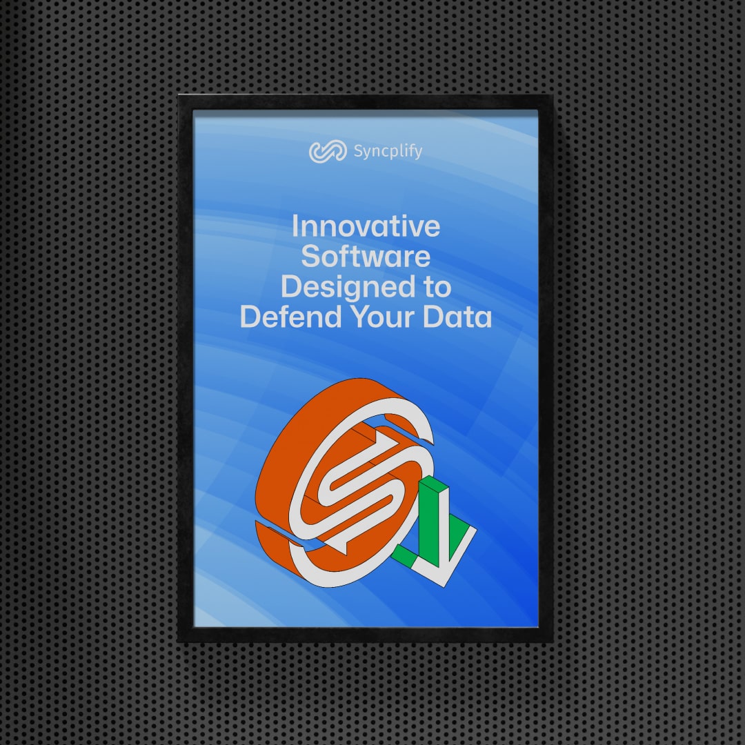
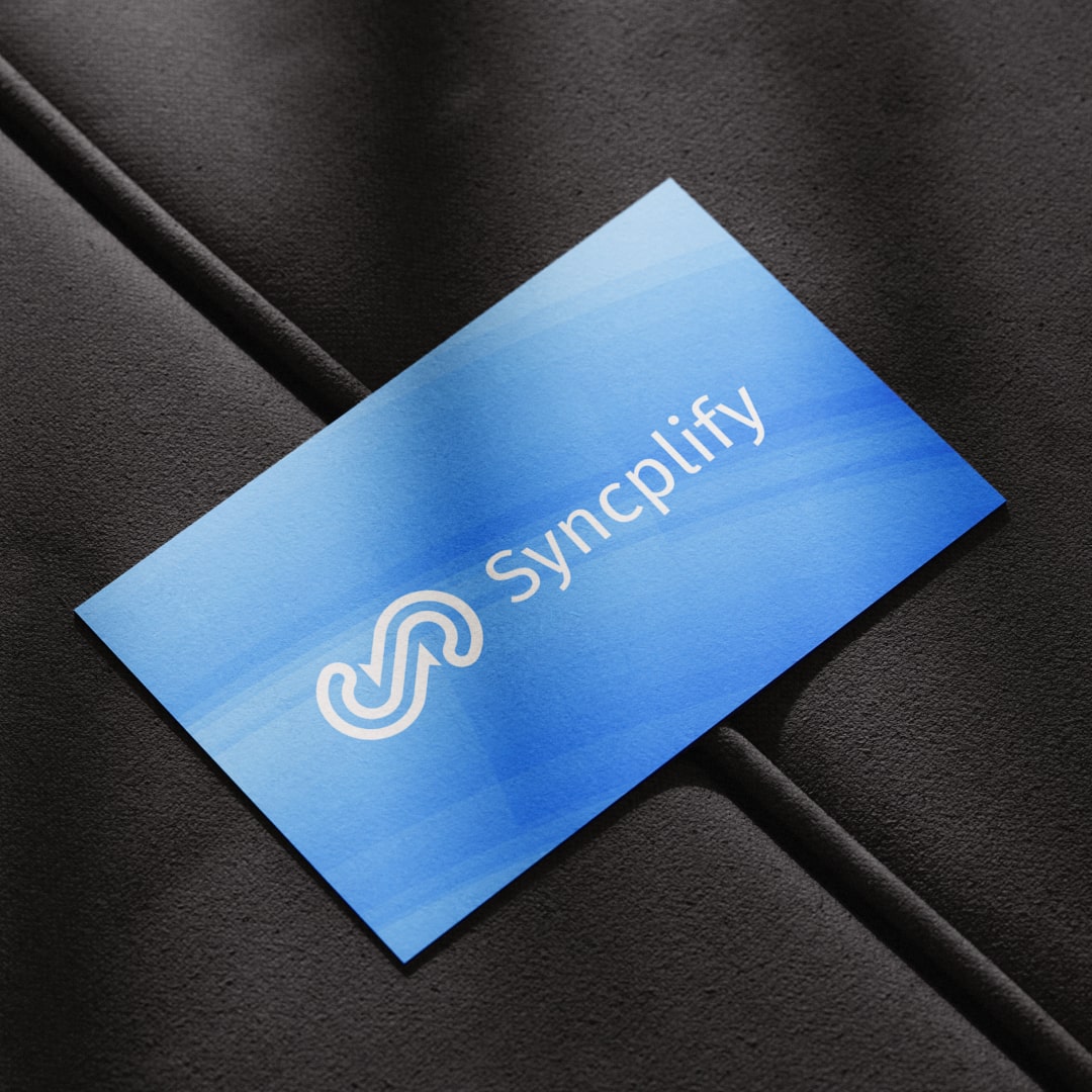
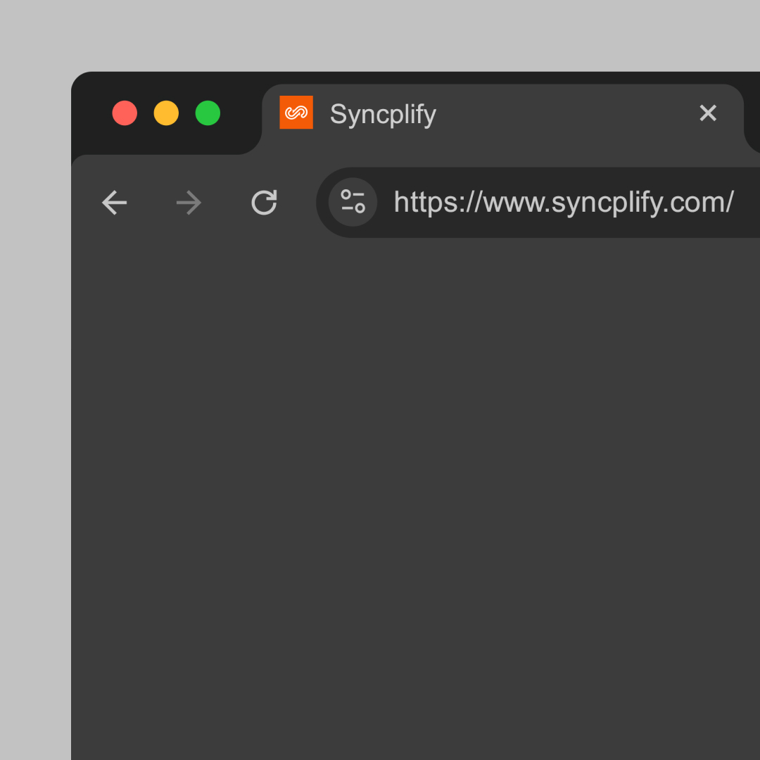
Syncplify approached us for a comprehensive brand refresh—one that elevated the brand without disrupting the trust and familiarity they had earned over a decade. We redesigned their full suite of product icons, modernized their visual language, and rebuilt their website from the ground up, migrating seamlessly from WordPress to Webflow.
The Challenge
Syncplify had earned deep loyalty from technical users who knew the product was bulletproof. The orange logo, the familiar interface, the no-nonsense aesthetic—these weren't just design choices. They were trust signals built over the years.
The challenge was finding the middle ground: modernizing the brand without making longtime users feel like they'd lost something familiar. Changing too much risked sending the wrong signal; changing too little meant missing a powerful opportunity to evolve.
So the question became: How do you modernize a brand without alienating the users who already love it? How do you signal growth and sophistication to enterprise buyers while preserving the visual cues that long-time customers rely on?
Too much change risks breaking trust. Too little leaves the brand stuck in a previous era.
The Brief
Syncplify came to us with a clear mandate: redesign their product icons, refresh their brand assets, and rebuild their website. But beneath the tactical brief was a deeper question: how do we make Syncplify look as good as it actually is?
The logo and the signature orange were non-negotiable. Everything else was open for exploration.
Our Approach
We started by listening. Not just to the founders, but to the brand itself—what it had earned, what it represented, what couldn't be lost.
The orange wasn't just a color; it was recognition. The utilitarian aesthetic wasn't dated; it was honest. We didn't see these as limitations. They were the parts of the brand that had actually earned trust, and we wanted to protect that.
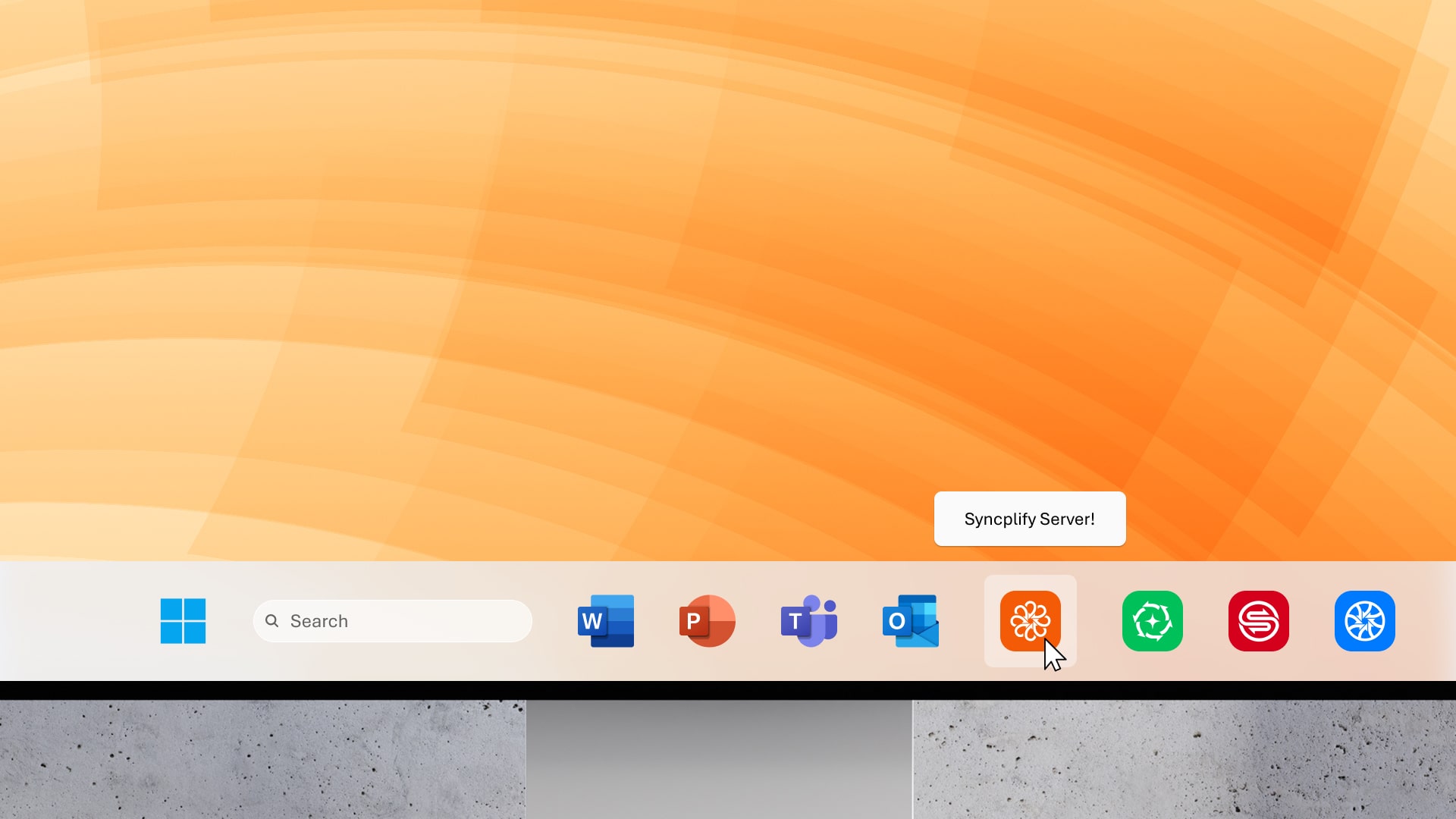
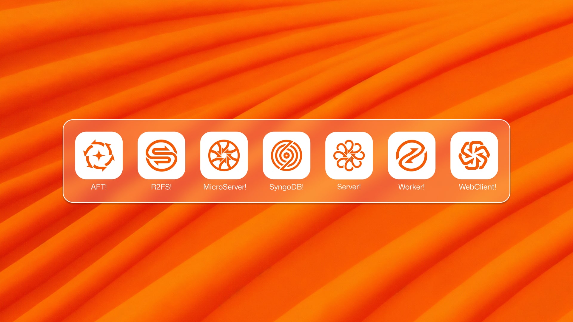
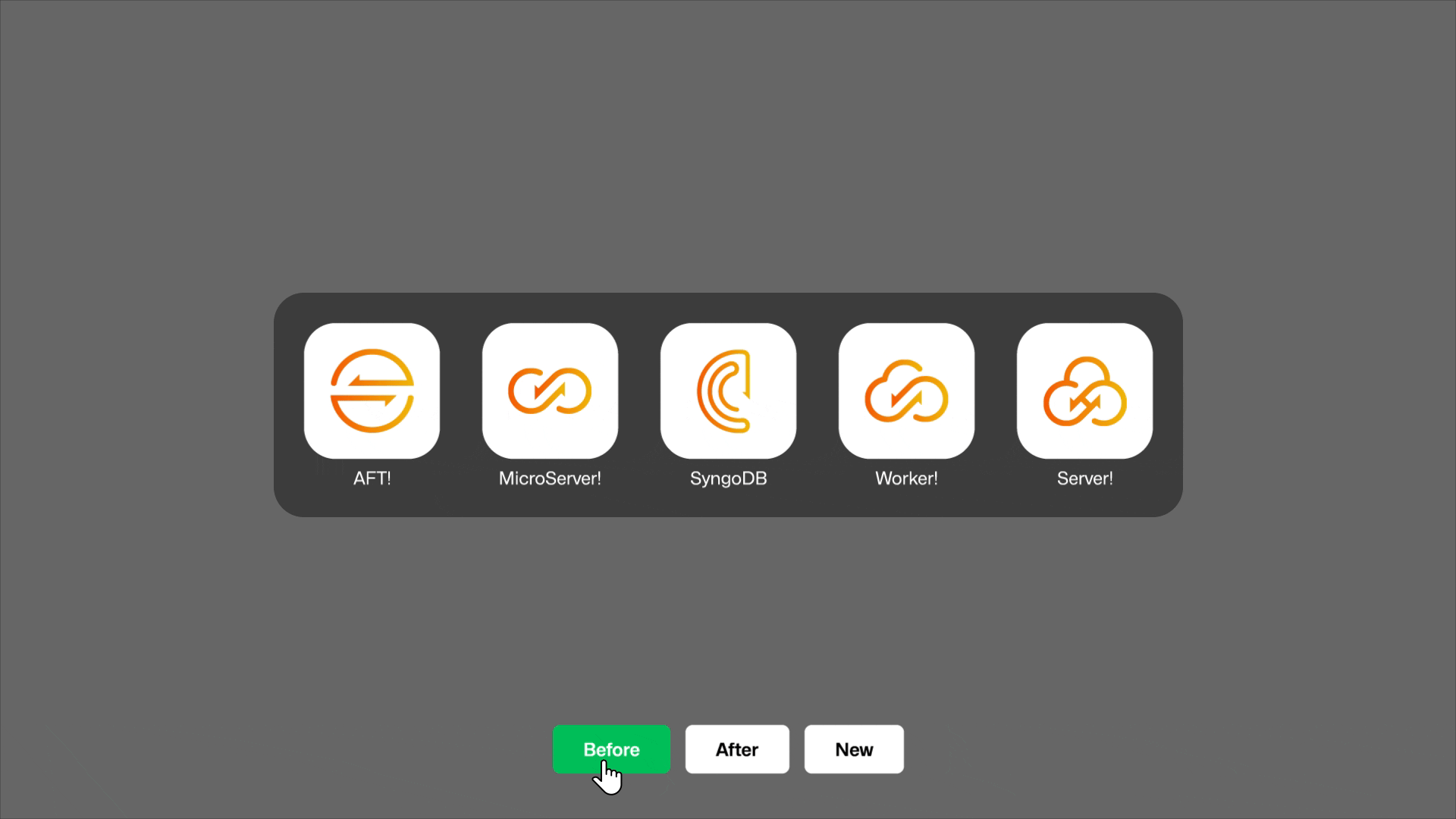
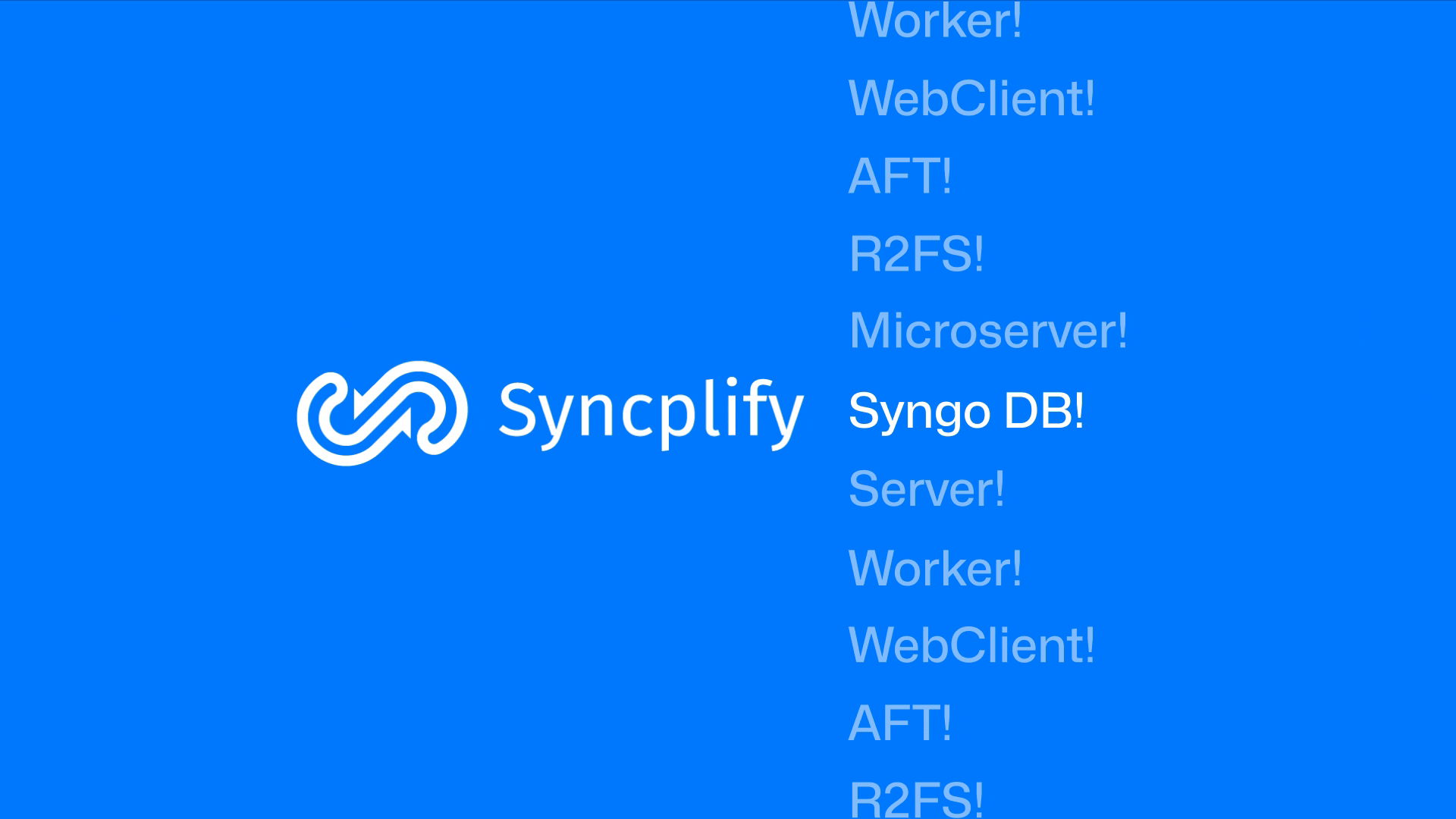
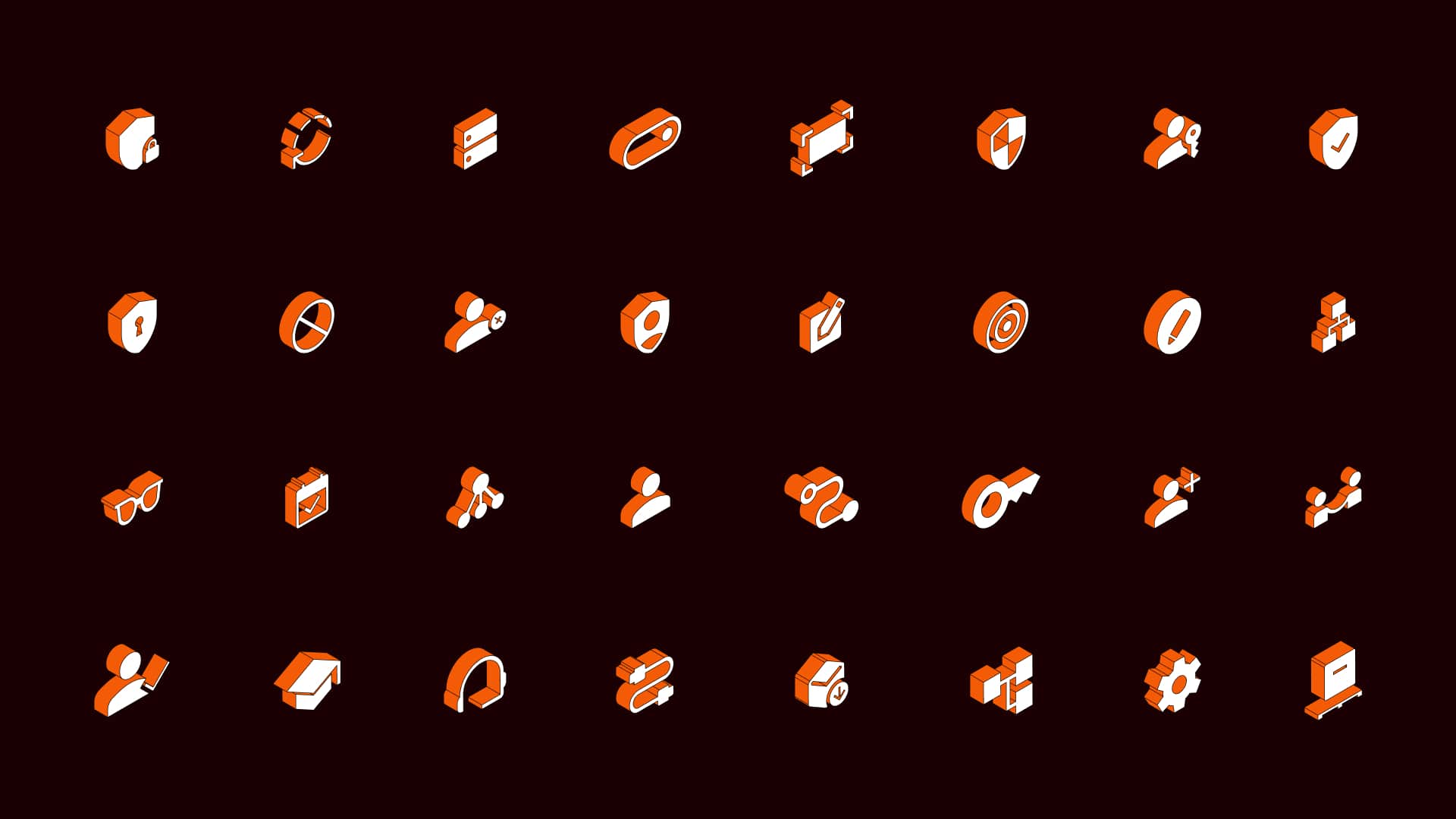
Working closely with Syncplify's founders, we mapped every product, understood its function, and redesigned each icon to feel part of a cohesive system, modern enough to signal progress, familiar enough to feel like home.
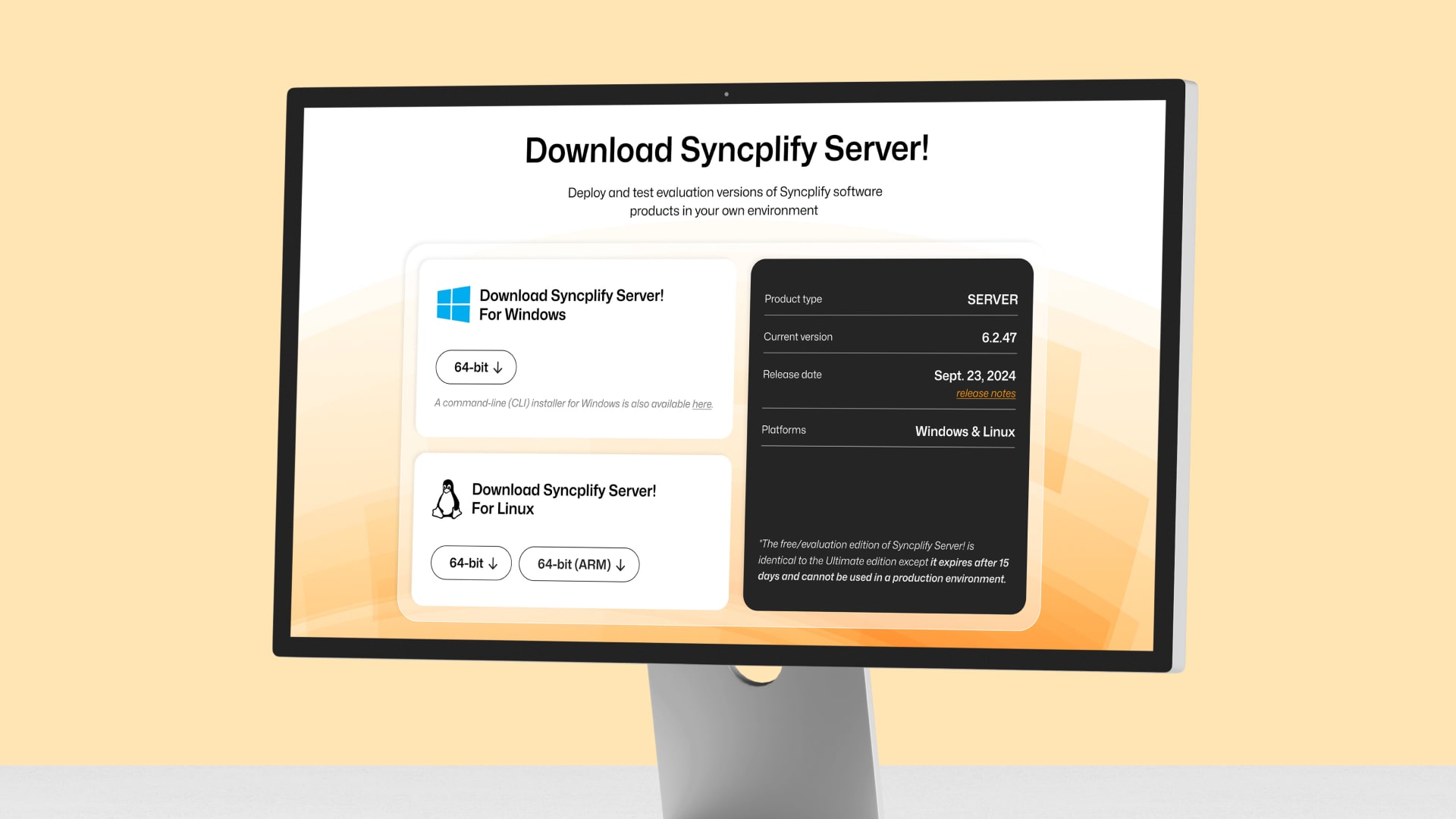
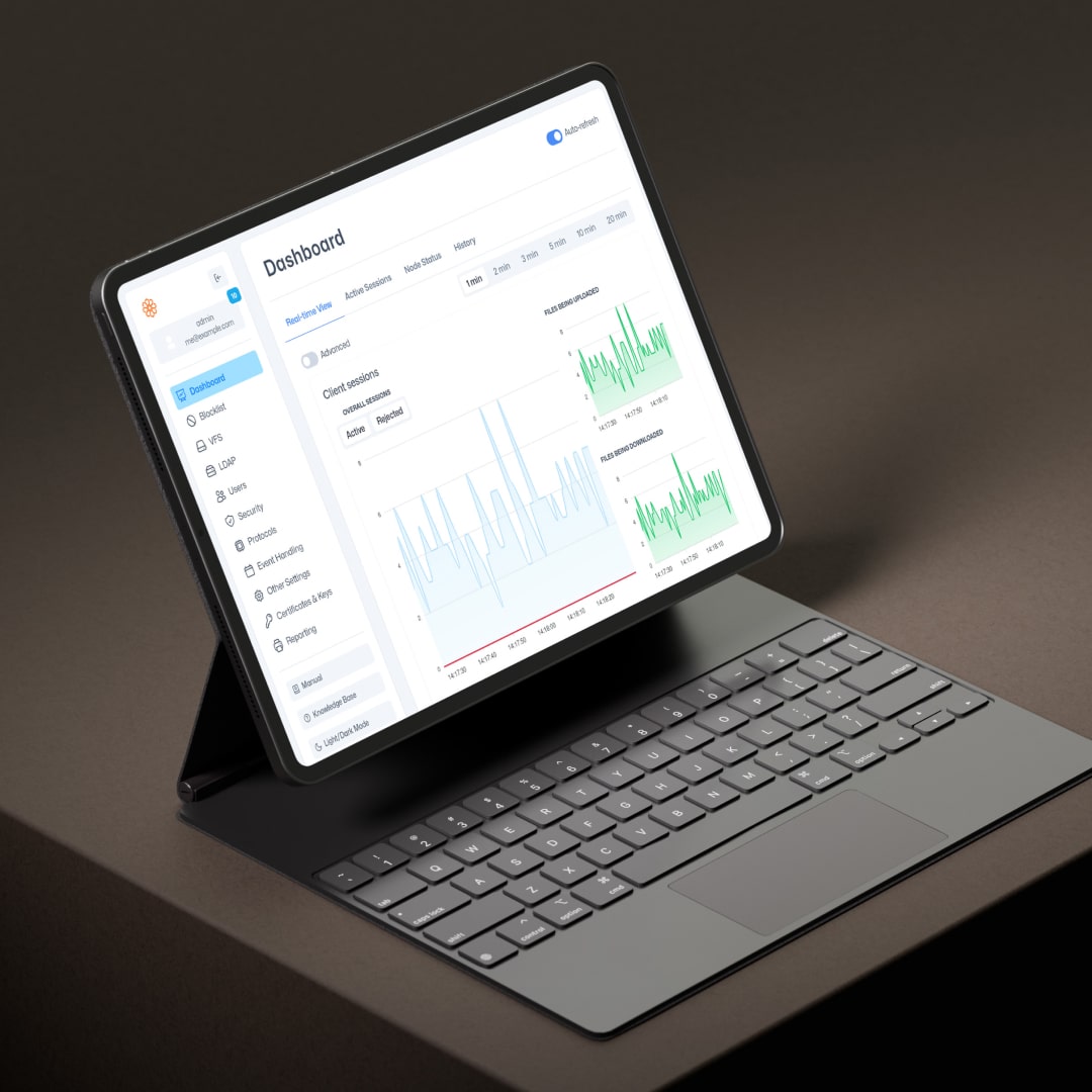
The website followed the same philosophy: cleaner, sharper, more confident, but unmistakably Syncplify. We migrated from WordPress to Webflow, giving their team the flexibility to grow without sacrificing performance or design integrity.
We weren't trying to turn Syncplify into something new. We wanted to close the gap between how good the product actually is and how the brand presented itself.
Impact
The new brand system does what the old one couldn't: it matches Syncplify's reputation.
Enterprise perception: Enterprise buyers now encounter a brand that signals the same reliability and sophistication as the product itself. Long-time users still recognize the Syncplify they trust, but now it looks ready for the next decade.
Visual cohesion: The product icons work as a unified family, creating visual consistency across an expanding suite.
Website performance: The website loads faster, converts cleaner, and gives Syncplify's team full control over their digital presence.
Brand-product alignment: Most importantly, the brand no longer undersells what's underneath. When your software protects the most sensitive data on the planet, your brand should reflect that weight.
The product was always strong. Now the brand actually reflects that.
We wrote an article to give you an insight into the project, read it here.