Floralinne
Your invitation to stand out
Clothing in Nigeria is rarely just about what we wear. It is a form of expression, a marker of identity, and an important part of how we participate in our culture. From weddings and birthdays to religious celebrations and everyday life, what we wear often reflects the occasion's significance, our personal taste, and how we want to be seen.
Fabrics play an important role in this expression. The colour, texture and pattern of a fabric can influence an entire look, while the choice of jewellery brings it together. The right piece can transform an outfit, complement a personal style or become the detail people remember. Together, fabrics and jewellery give people the freedom to make a statement, whether subtle or unmistakable.
For Floralinne, this presented an opportunity to build a brand around more than the products it sells. It was an opportunity to celebrate the role they play in helping people express themselves.
Brand Naming, Brand Strategy, Verbal Identity and Visual Identity

The idea
Your invitation to stand out
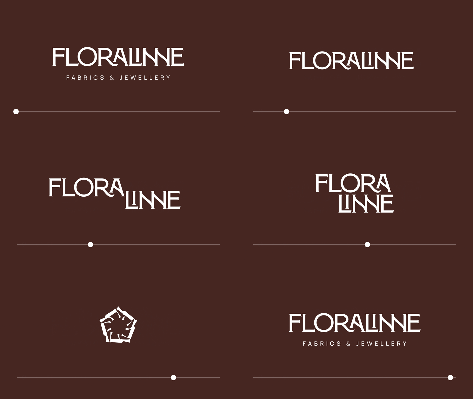
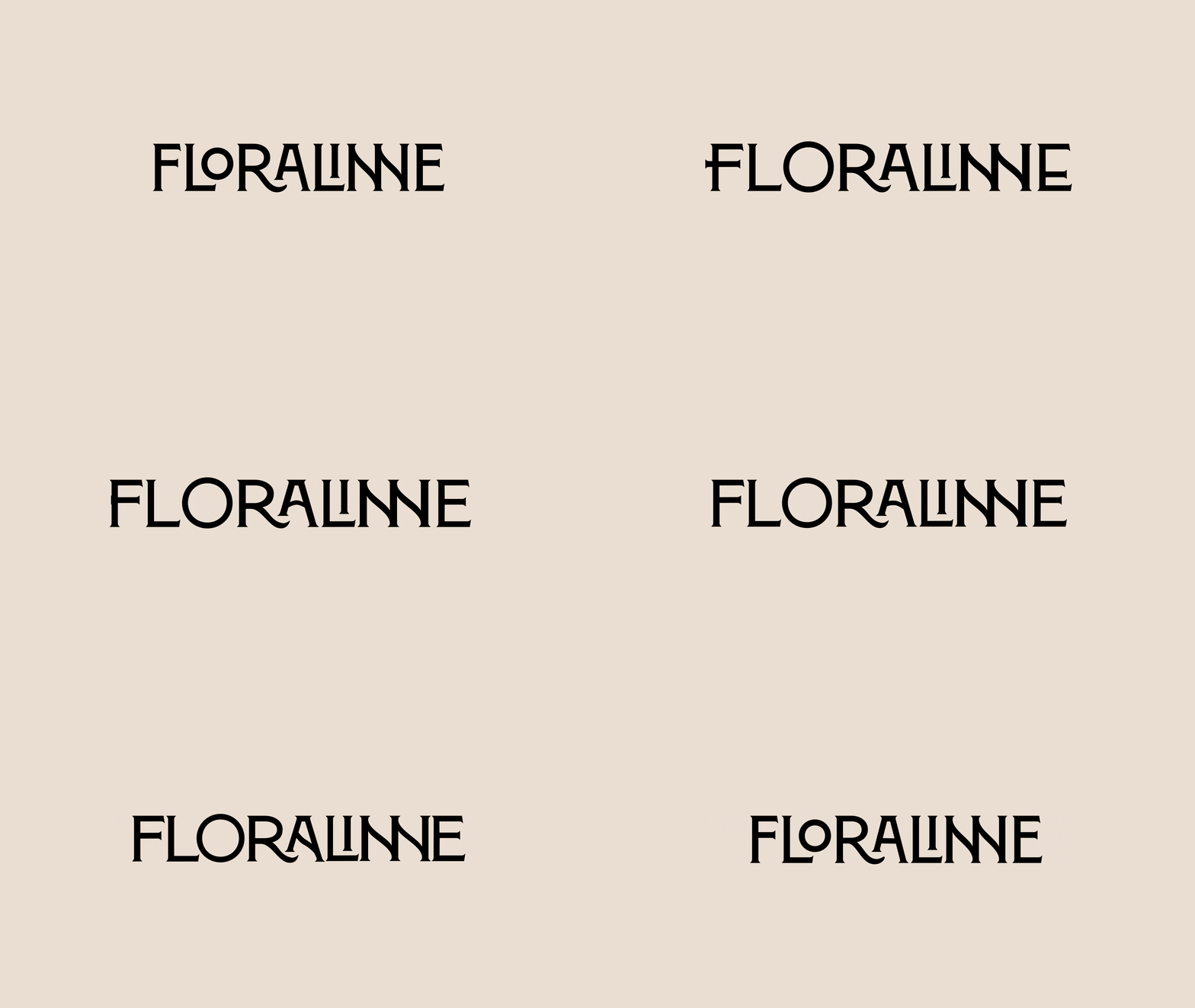
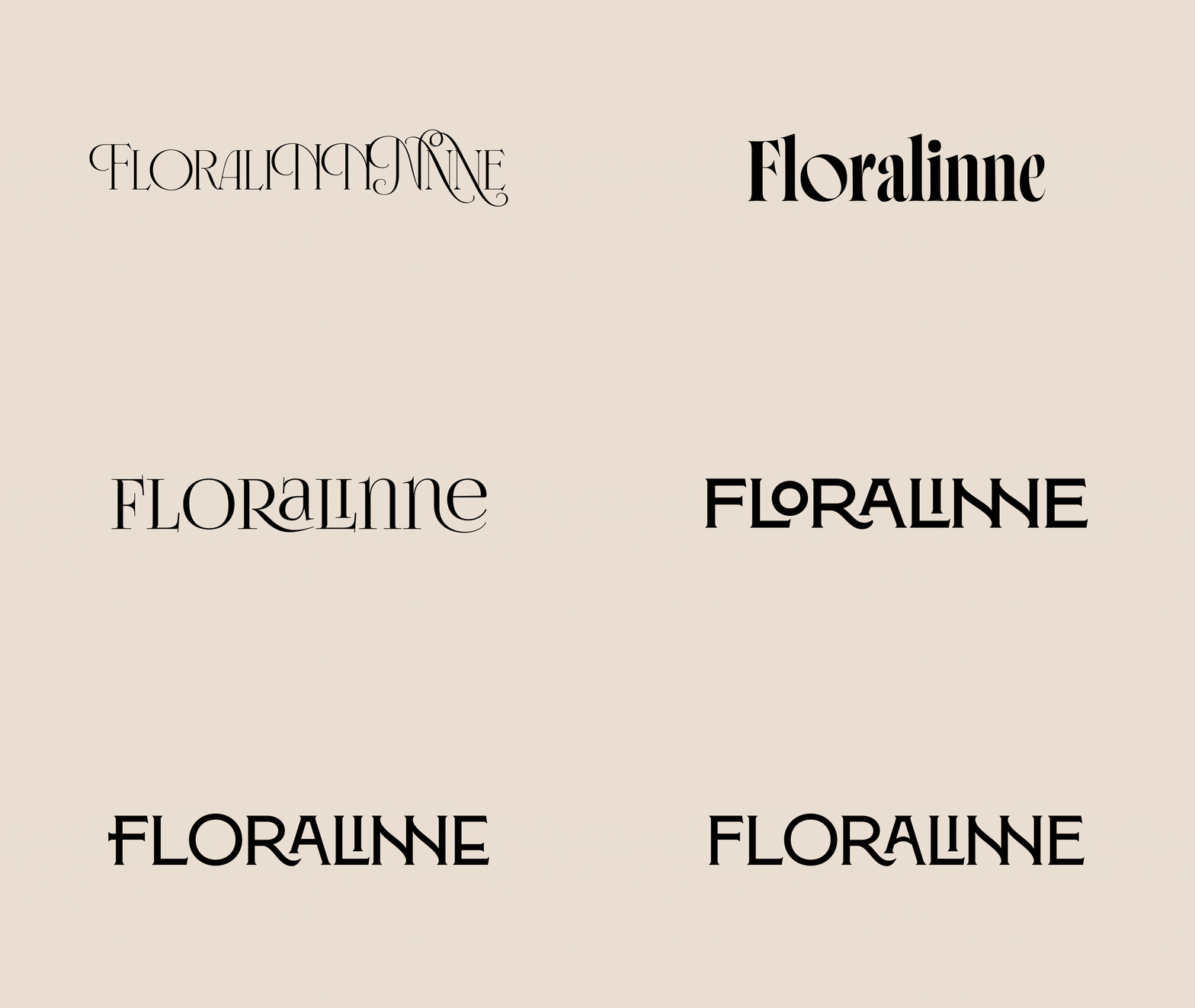
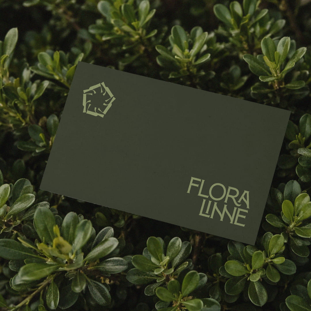
We developed a custom wordmark as the primary expression of the brand, with three configurations: a full lockup featuring the complete name, the standalone wordmark, and a stacked version. This gives Floralinne the flexibility to adapt its identity across different formats while maintaining a consistent presence.
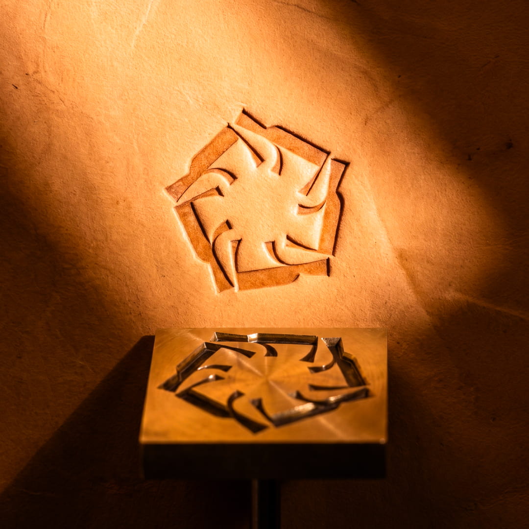
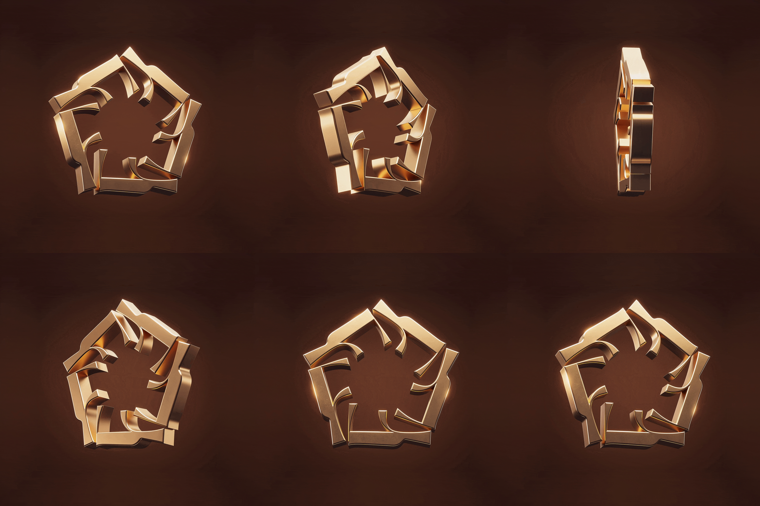
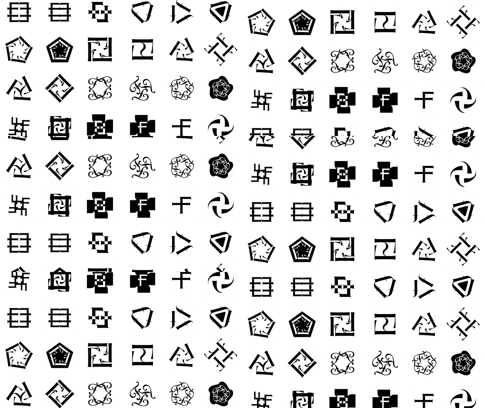
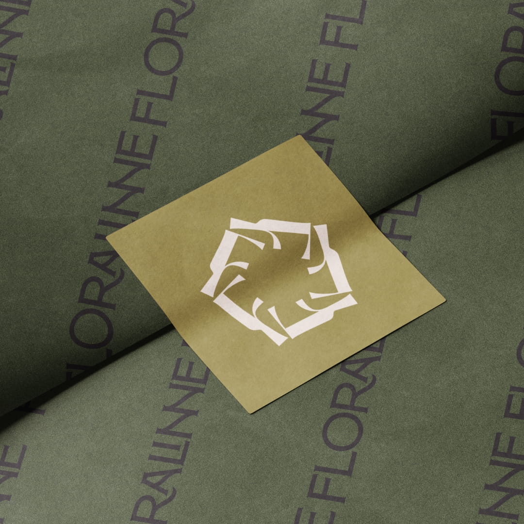
Alongside it, we created a logomark built around the letter “F”, shaped into a crown-like symbol that can stand independently as a distinctive brand emblem. Beyond its visual function, the symbol carries a personal meaning: its five “F” forms represent the founder, her husband and their three children. This brings family into the identity itself, reflecting the personal story at the heart of Floralinne as it grows into something bigger.



Building Blocks
A language of its own
We built Floralinne’s colour and typography systems to create a consistent visual language that communicates quality while allowing the products to take centre stage. Two carefully selected typefaces balance elegance with clarity, giving the brand the flexibility to move between expressive statements and practical product information.
The intentionally limited colour palette is led by mahogany, whose warmth, depth and richness anchor the identity. Supporting colours introduce contrast and variation while maintaining visual cohesion, ensuring Floralinne remains recognisable across different brand touchpoints.

The brand
Beyond the logo
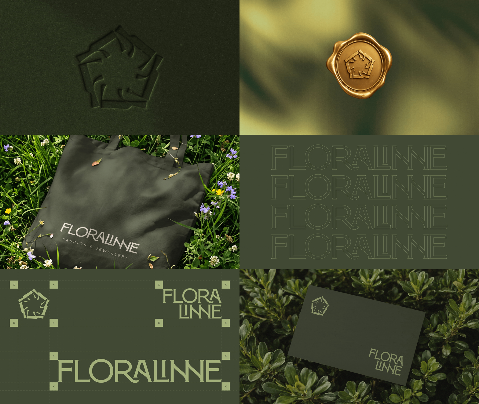
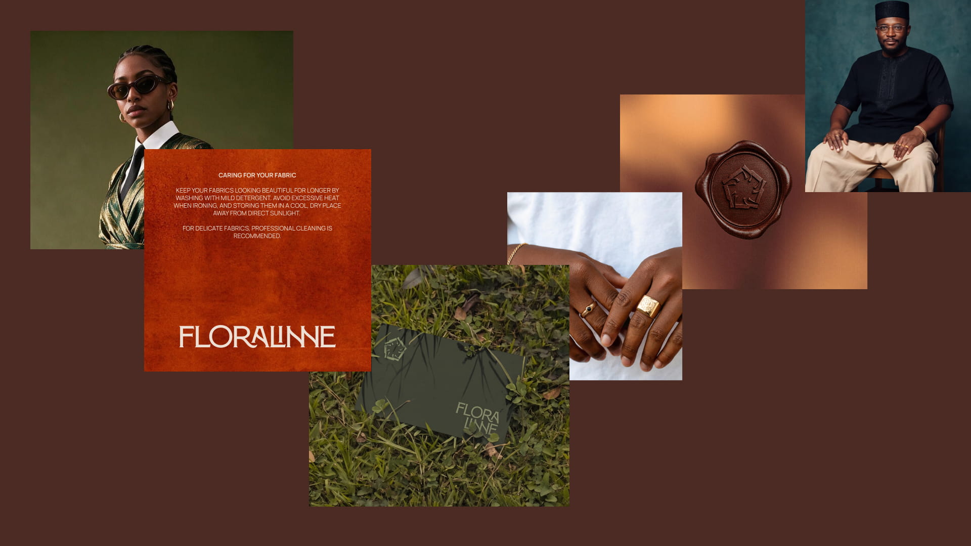
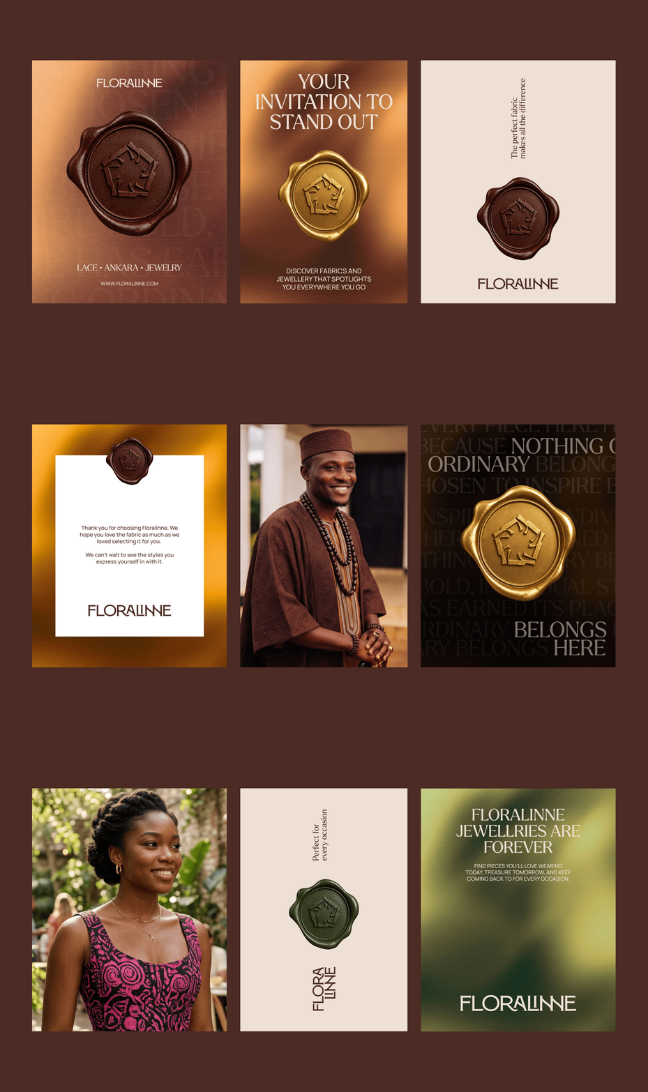
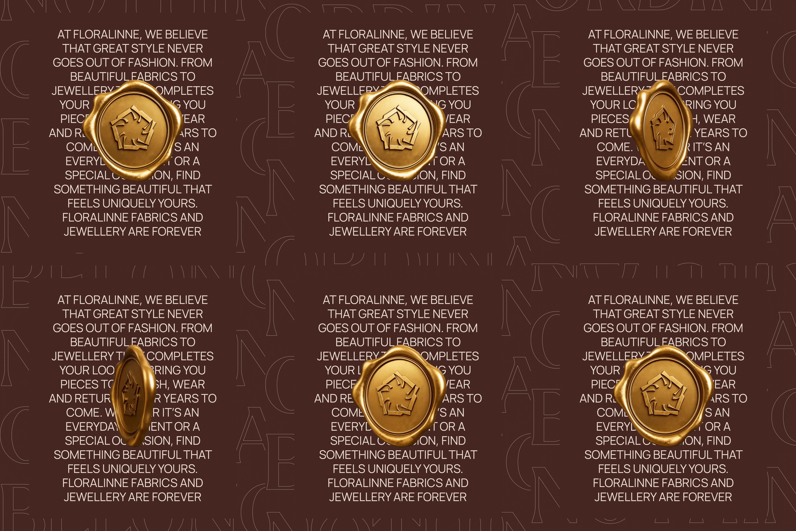
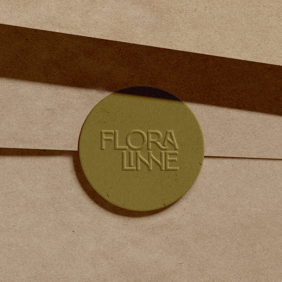
With the core identity established, we developed a broader system of brand assets to bring Floralinne to life across its customer touchpoints. Wax-seal interpretations of the logo introduced a tactile brand element, reinforcing a sense of craft, care and distinction.
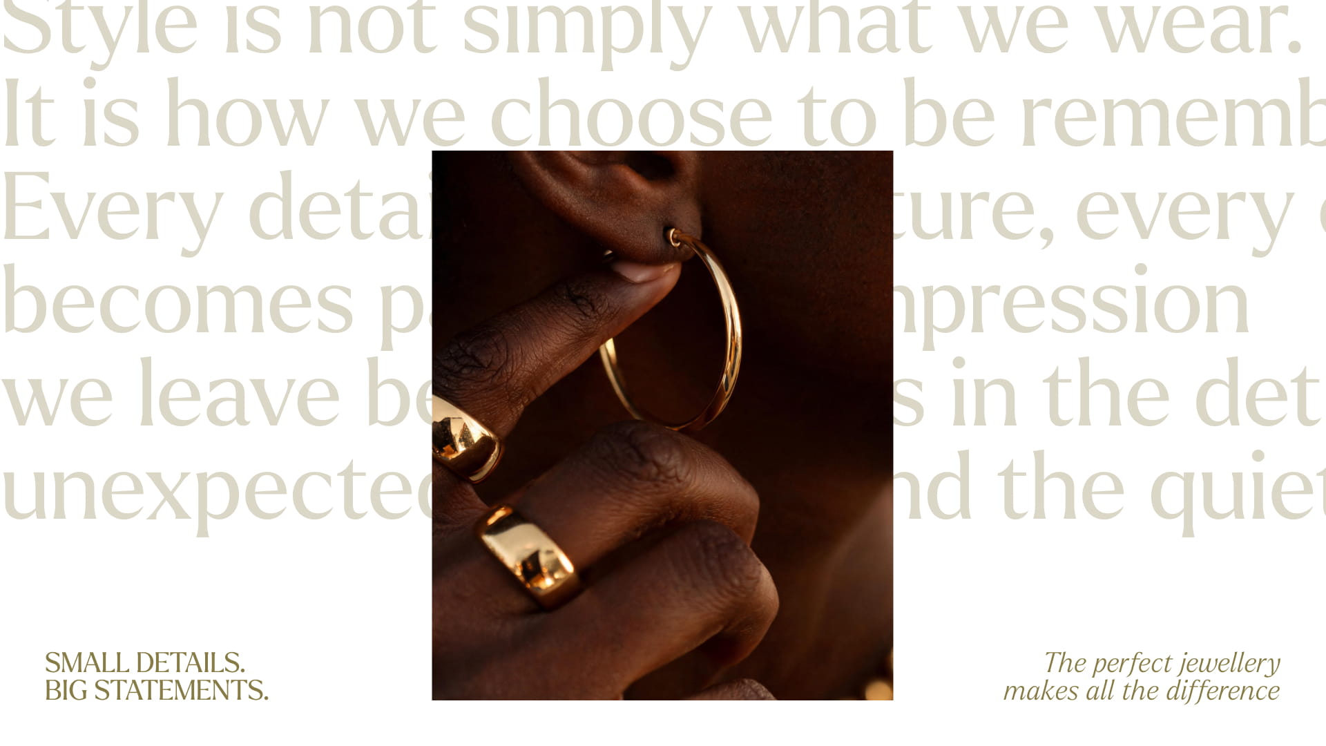
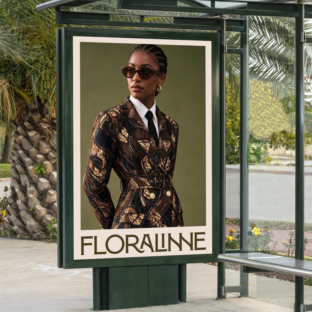
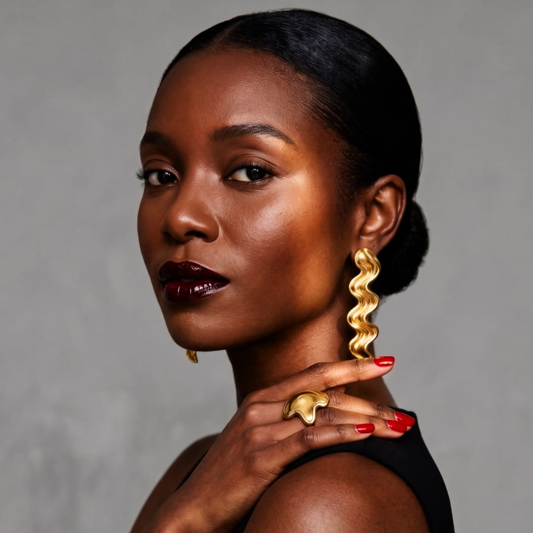
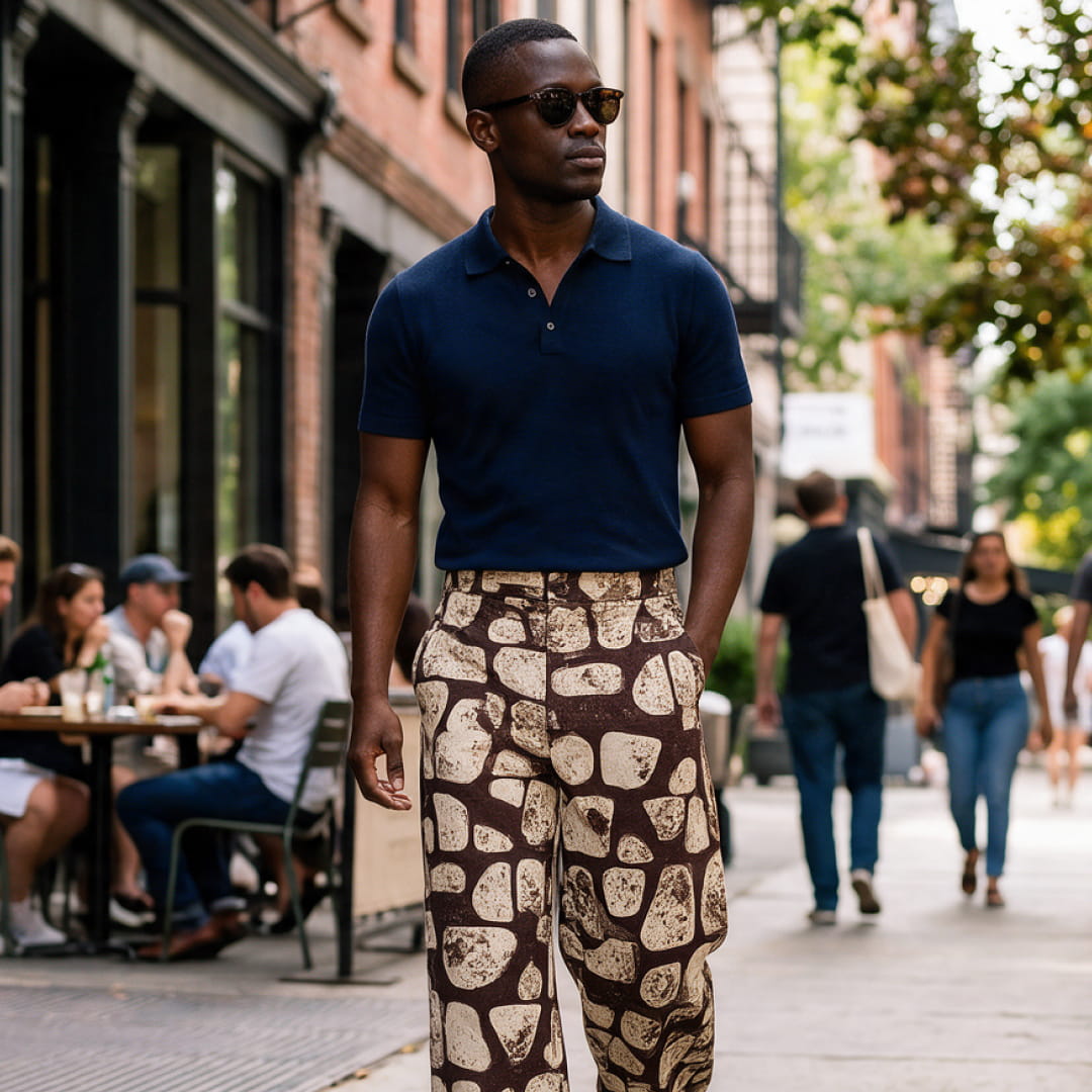
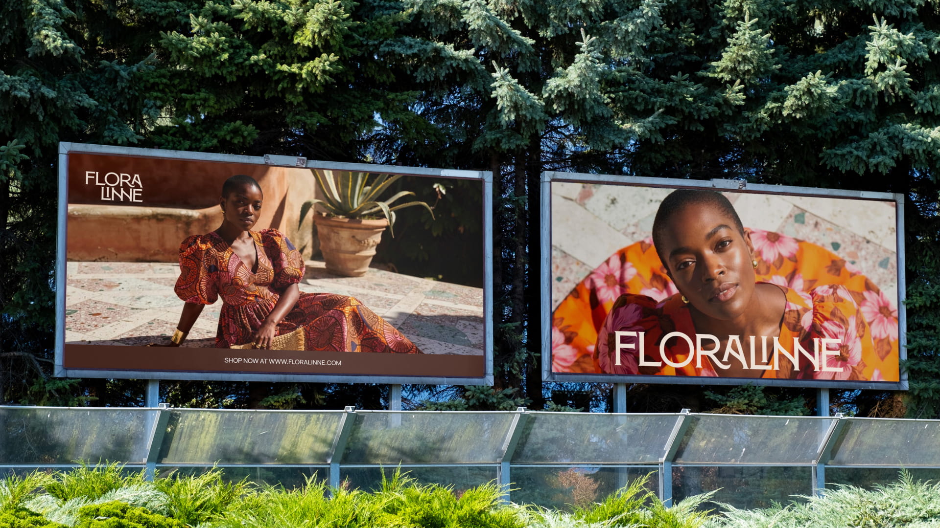
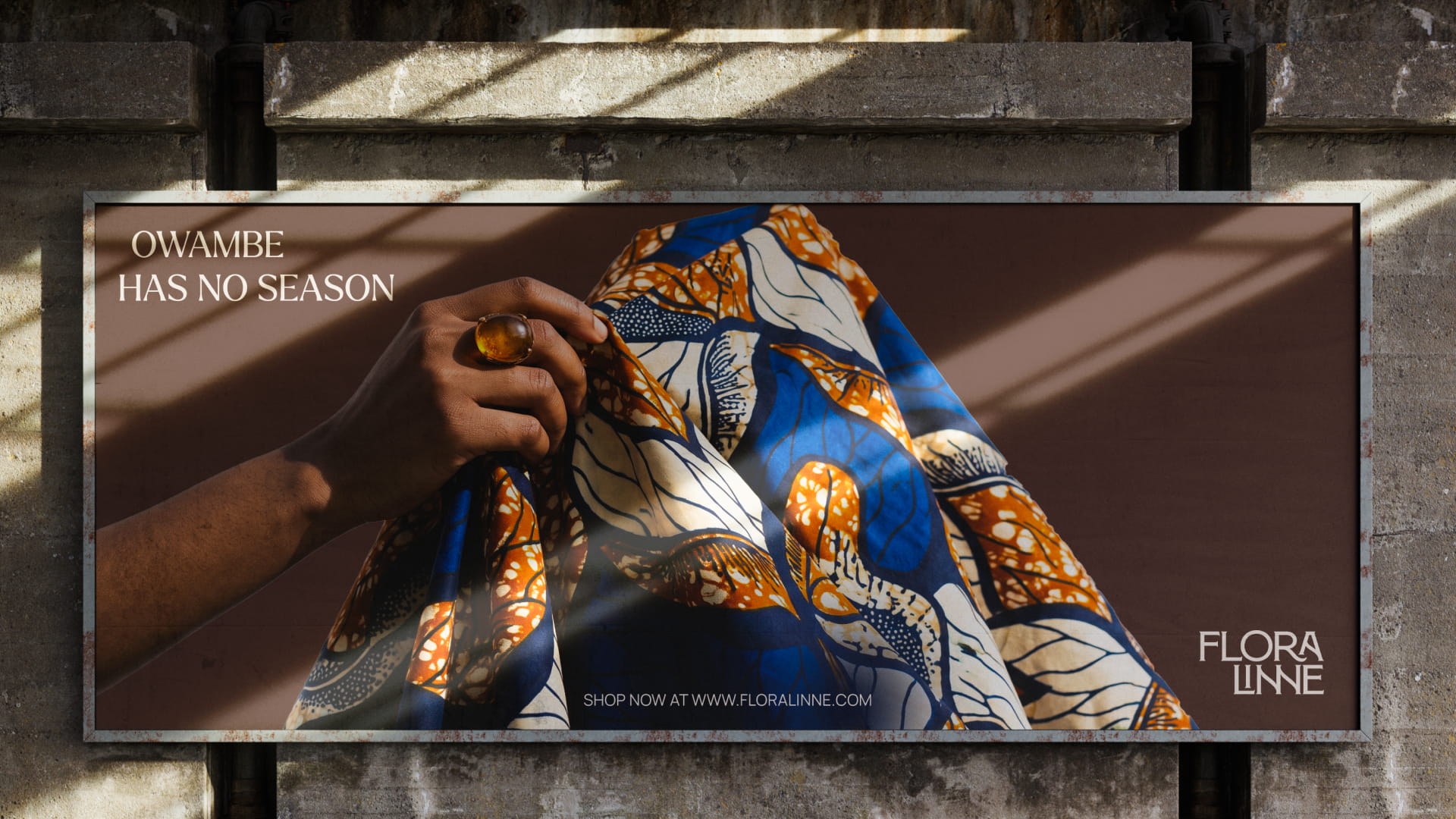
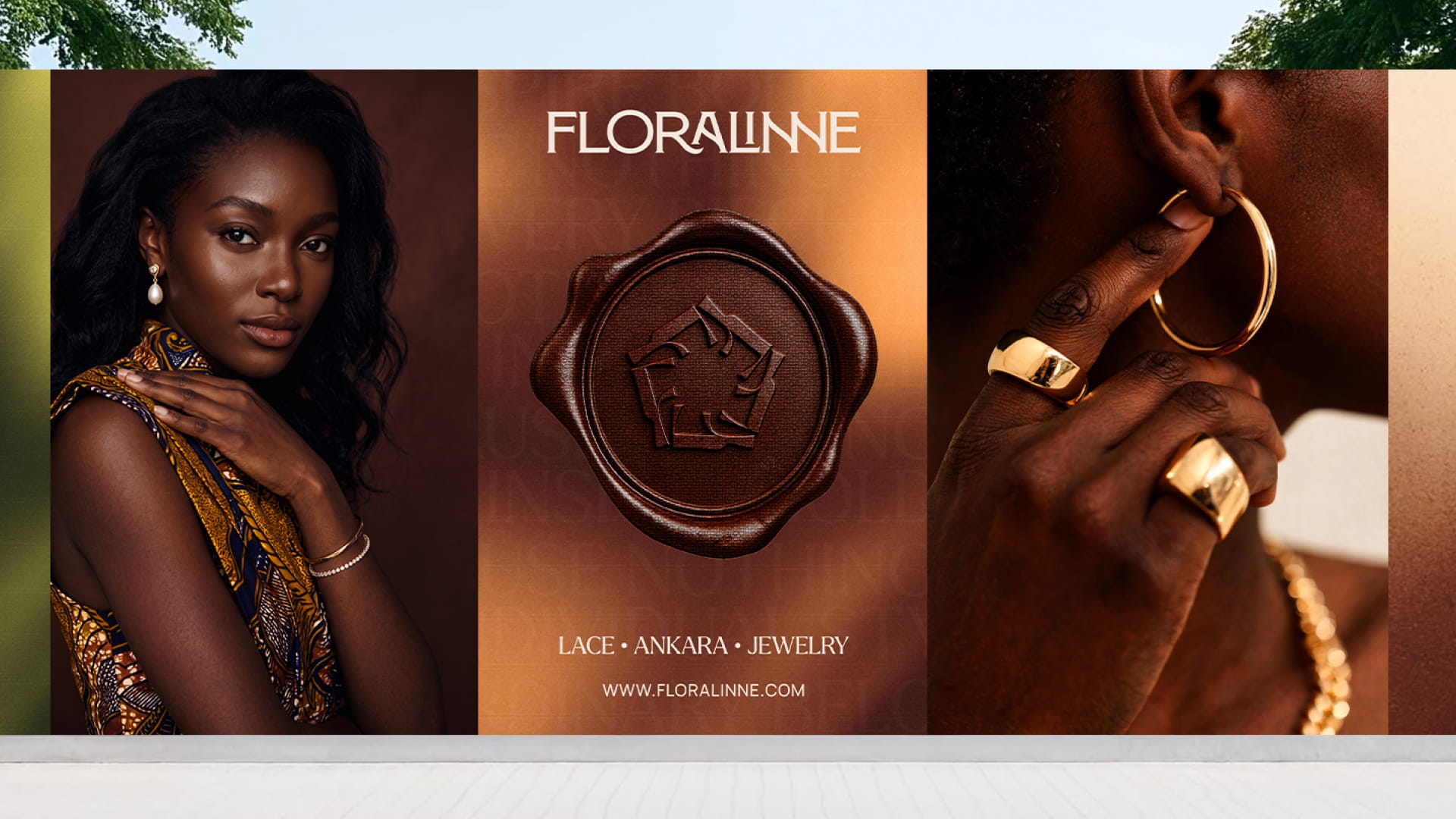
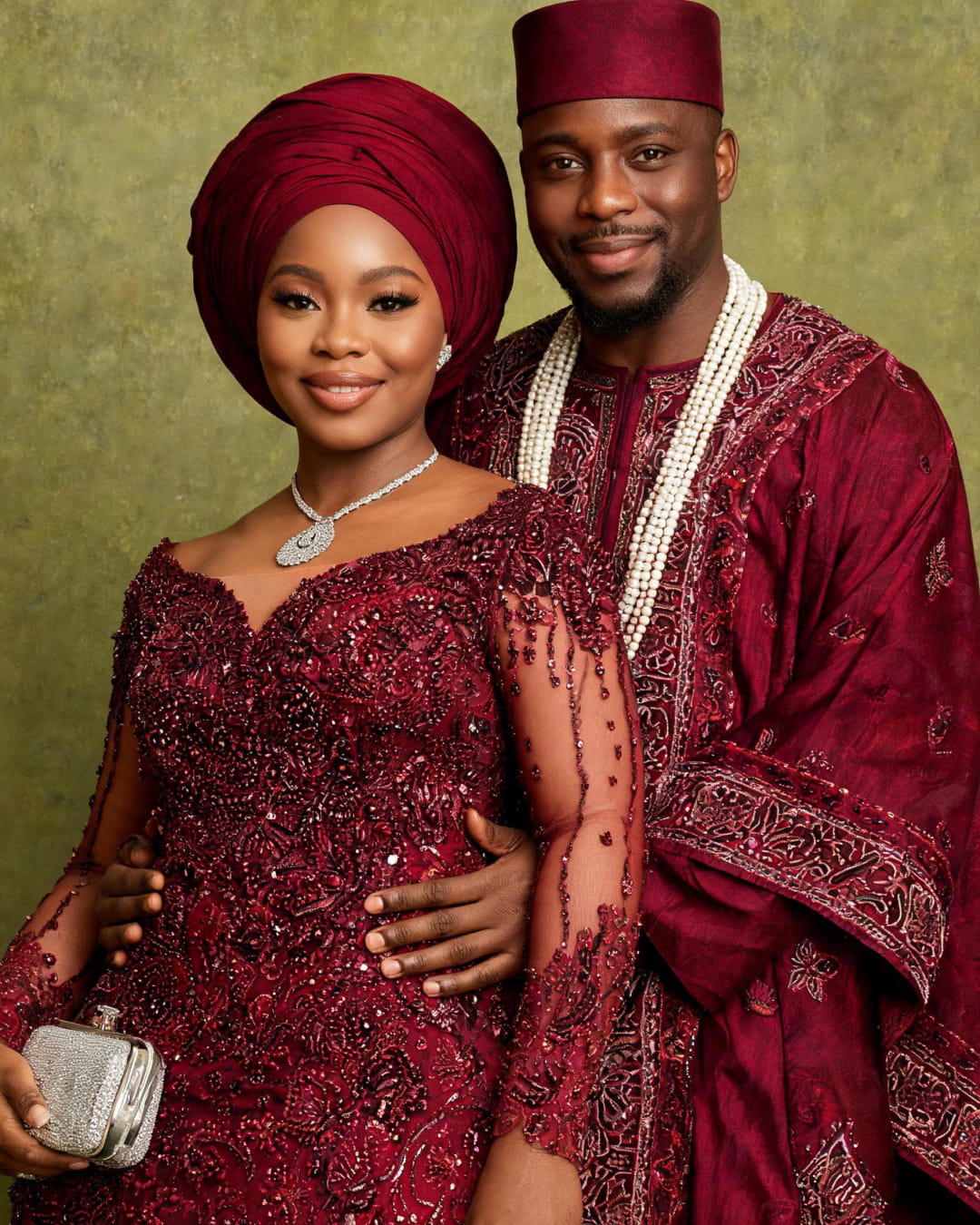
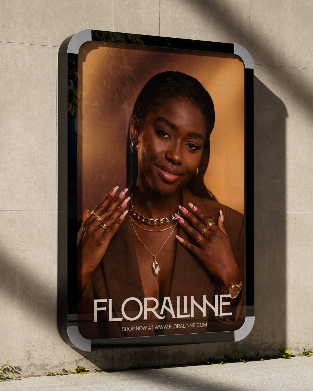
Photography further shaped the brand’s visual direction through considered compositions and lighting, giving the products and brand materials a premium, editorial quality. These elements were brought together across different applications, demonstrating how Floralinne could maintain a consistent identity while adapting to different contexts.
Working with Glyn was a really good experience. I especially love the name Floralinne and how they brought my children’s names together to create something so personal and meaningful. They took the time to understand my vision, walked me through the process, and turned my ideas into a brand that feels true to what I had in mind. Everything came together smoothly, and I’m really happy with the result.

Olaleye Olayemi
Founder, Floralinne
Bringing it to life
Floralinne Fabrics & Jewellery are forever
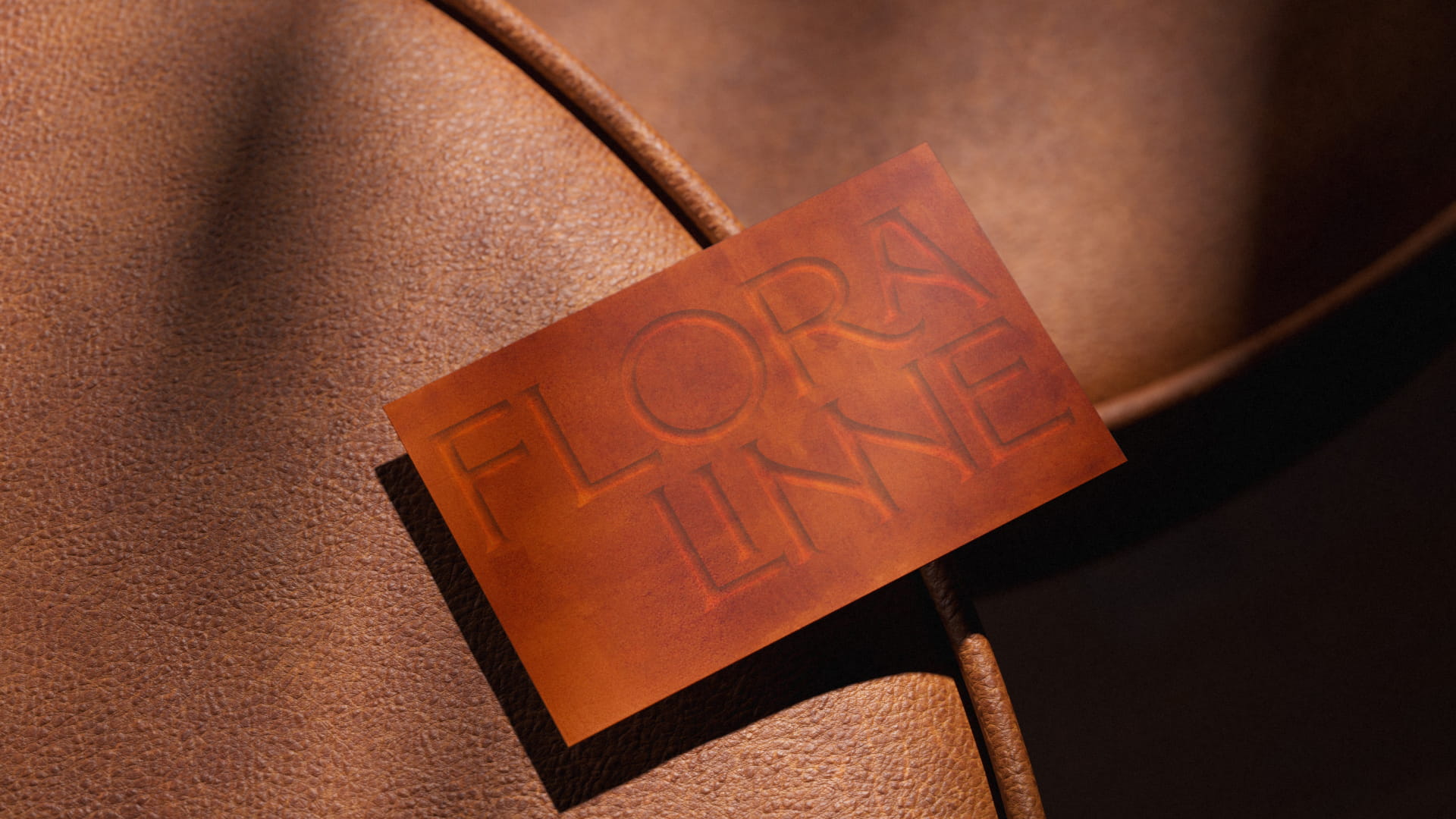
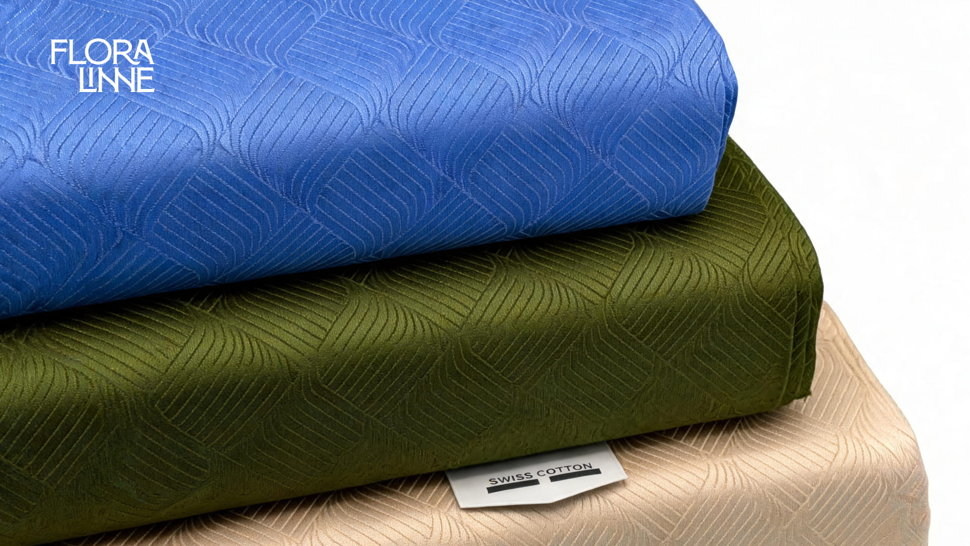
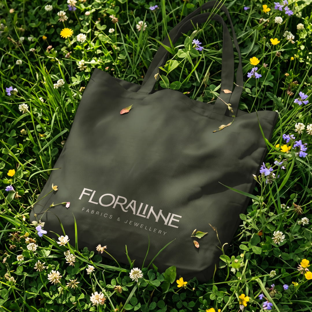
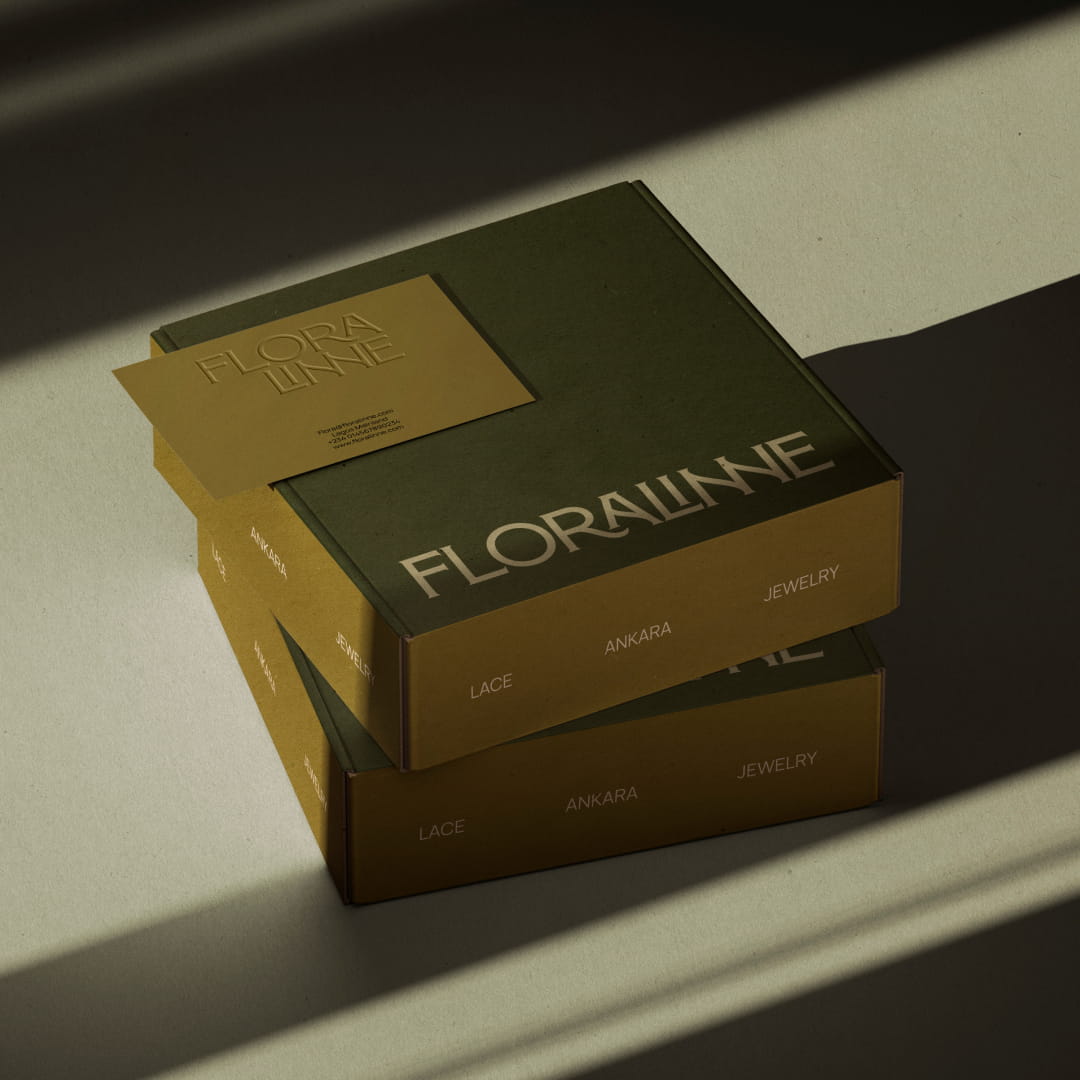
Through touchpoint applications, material explorations and brand photography, we brought the identity into the contexts where customers would encounter it. The applications show the relationship between the wordmark, emblem, colour palette, typography and supporting brand assets, while giving a sense of how these elements work together as a system.
From the tactile quality of the wax seal to the use of the identity across packaging and other branded materials, each expression reinforces the same underlying idea: Floralinne is an invitation to stand out.
The strategic challenge
Floralinne is a wholesale reseller of quality fabrics, specialising in Ankara and lace, alongside jewellery. Operating at the intersection of two complementary categories, the business serves customers looking for materials and accessories that help them dress for different occasions and express their individual styles.
The opportunity was to create a brand that could bring these offerings together under one recognisable identity. One that communicated quality, gave customers a reason to choose Floralinne, and could grow beyond its immediate market without losing the personal story behind the business.
This meant looking beyond the products themselves. We needed to establish what Floralinne should stand for, how it should present itself, and how it could build a distinct place in a competitive market.
The brief
The brief was to name the business and develop a premium brand identity that reflected the quality of its offerings while giving the company a stronger foundation for growth.
The name needed to be meaningful to the founder, bringing together the names of her three children in a way that felt natural and could stand on its own as a brand. Beyond naming, we needed to develop a clear positioning and a visual language that would make Floralinne recognisable across its products, packaging, communications and other customer touchpoints.
The result needed to balance personal meaning with commercial relevance: a brand rooted in family, built for customers, and flexible enough to grow with the business.
Our approach
Rooted in family
When the founder approached us, she had one important request: the business name needed to be coined from the names of her three children, Flora, Rosaline and Dennis.
This gave us a clear starting point, but it also presented an interesting naming challenge. We needed a way to represent all three names without forcing them together or creating something that felt more like a combination of names than a brand in its own right.
We explored different combinations, sounds and naming structures, considering how each option looked, sounded and felt. We wanted a name that could hold personal significance while remaining distinctive, memorable and suitable for a premium fabrics and jewellery business.
After exploring several directions, we settled on Floralinne.
Pronounced flor-uh-l een (with the final “linne” sounding like “leen”), the name brings together the first two names more directly, with Flora drawn from Flora and line inspired by Rosaline. The double “n” introduces a subtle reference to Dennis, incorporating the third child's name into the construction of the word.
Rather than spelling out all three names, Floralinne gives each one a place within a single, cohesive name. It has a personal story, but it doesn't need that story to feel complete. It is feminine without being restrictive, distinctive without being difficult to approach, and broad enough to represent both fabrics and jewellery.
We paired it with Fabrics & Jewellery to make the business's offering immediately clear. Floralinne became the shorter, more versatile expression of the brand, while the full name provided clarity wherever customers needed to know what the business does.
Defining the direction
With the name established, we moved on to the larger brand strategy. We wanted to give Floralinne a clear point of view that connected the quality of its products to the role they play in people's lives.
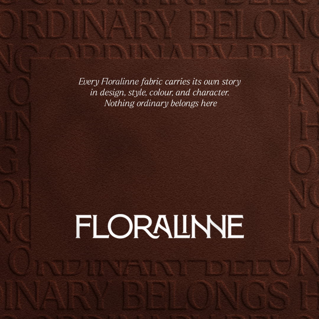
Two complementary directions emerged: “Your invitation to stand out” and “Nothing ordinary belongs here.”
The first speaks to the customer. It positions Floralinne as an invitation to express personal style, make an impression and feel confident in what you wear. Whether someone is selecting Ankara for a special outfit, choosing lace for a celebration or finding jewellery to complete a look, Floralinne offers the pieces that help bring that expression to life.
The second speaks to the brand's character. It establishes an expectation that the fabrics and jewellery are worth paying attention to, and that the details matter. It gives Floralinne a more confident voice, one that can be playful and expressive without losing its sense of quality.
Together, these directions gave us a foundation for the brand's positioning, verbal identity and visual expression. They connected the products to the occasions, feelings and personal statements they make possible, giving Floralinne a more meaningful role in its customers' lives.
Floralinne's visual identity needed to reflect the confidence of the brand idea and the identity recognisable, distinctive and capable of moving between the worlds of fabrics and jewellery without feeling out of place in either.
The impact
A foundation for what's next
Floralinne began with a personal ambition: to build a business whose name carried the names of the founder's children. Our role was to help turn that ambition into a brand with a clear identity, a defined point of view and room to grow.
Through naming, strategy and visual identity, we established a foundation that brings the personal story behind the business together with the needs of its customers. Floralinne now has a distinctive name, a cohesive visual system and a set of brand assets that can guide how it presents itself across different touchpoints.
The work also gives the business a clearer way to communicate what it offers and why it matters, connecting its fabrics and jewellery to the confidence, expression and occasions they help make possible.
Creative Direction & Brand Design
Paul Obayagbona
Brand Design
Logo Design
Motion Design