Leaky Paywall

2022 marked a crisis point for digital publishers. Traditional advertising revenue was in freefall, social media algorithms were strangling organic reach, and readers had grown accustomed to free content. Yet subscription fatigue was real. Audiences were reluctant to commit to yet another monthly payment.
In this challenging landscape, Leaky Paywall had quietly built something different: a subscription platform that didn't force publishers to choose between free content and paid subscriptions. Instead, it created a "leaky" experience, strategic free access that converted casual browsers into committed subscribers.
But their brand didn't reflect this sophisticated approach.
We helped them communicate what made them essential.
Visual Identity | Animation
Deck Design | Website Design
Brand Guidelines

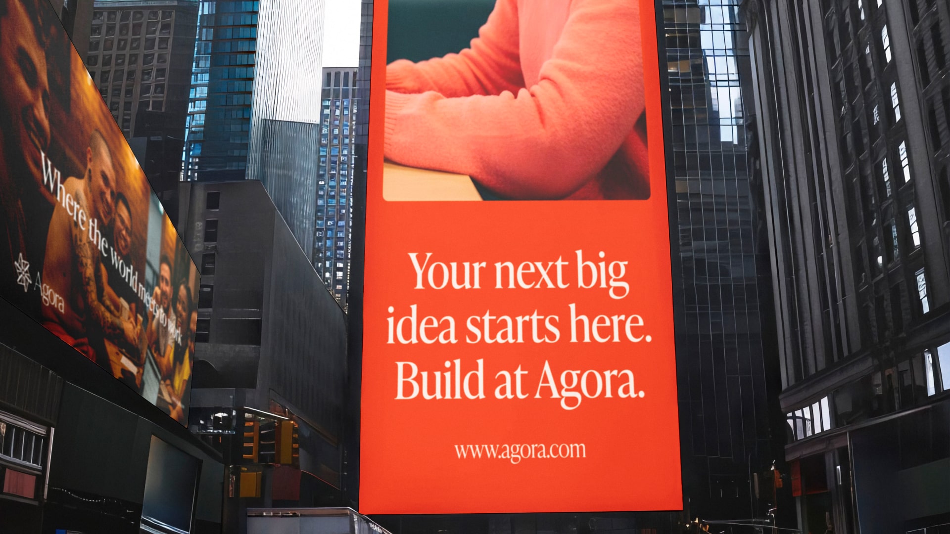
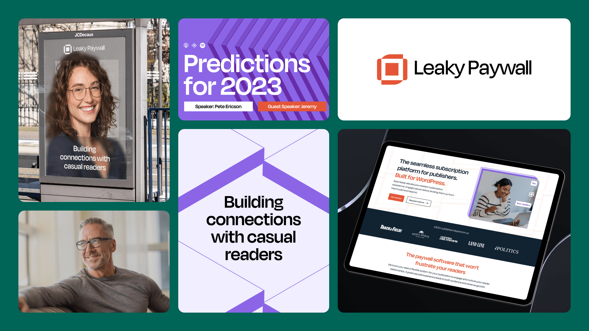
Building connections with casual readers
The breakthrough insight: successful subscription models aren't about restricting access, they're about creating connection. Leaky Paywall doesn't build walls between publishers and readers; it builds bridges. The platform helps publishers demonstrate value before asking for commitment, transforming casual browsers into engaged community members.
This approach recognizes that today's most successful publishers aren't just selling content, they're building relationships. Leaky Paywall becomes the infrastructure that makes these relationships possible, helping publishers thrive by putting their content in front of readers who will genuinely value it.


Visual Focus and Clarity
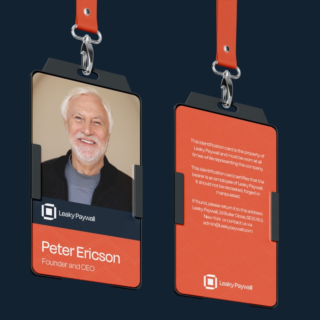
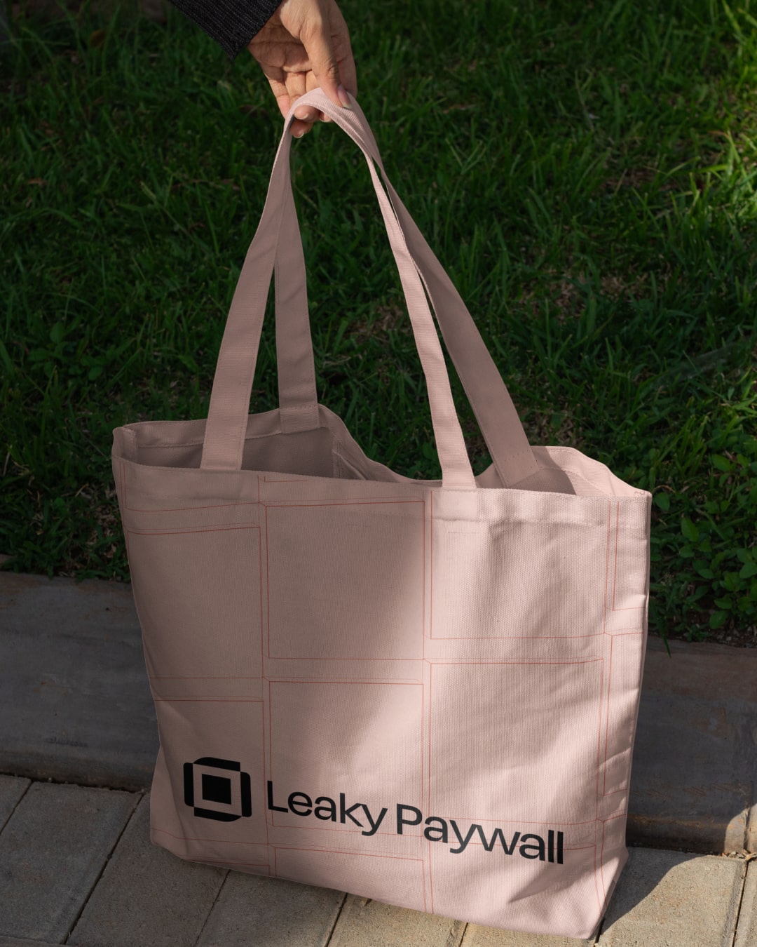
We have developed a sophisticated colour system that adapts to various contexts and content types. The palette scales from podcast branding to partnership materials while maintaining consistency. Each color serves a strategic purpose: distinguishing content types, highlighting calls-to-action, and creating visual hierarchy across complex publishing environments.
The type system strikes a balance between publisher credibility and reader accessibility. Headlines command attention without feeling aggressive, while body text prioritizes readability across devices and platforms. Every typographic choice reinforces Leaky Paywall's position as an infrastructure that publishers can depend on.


An identity built on stacks
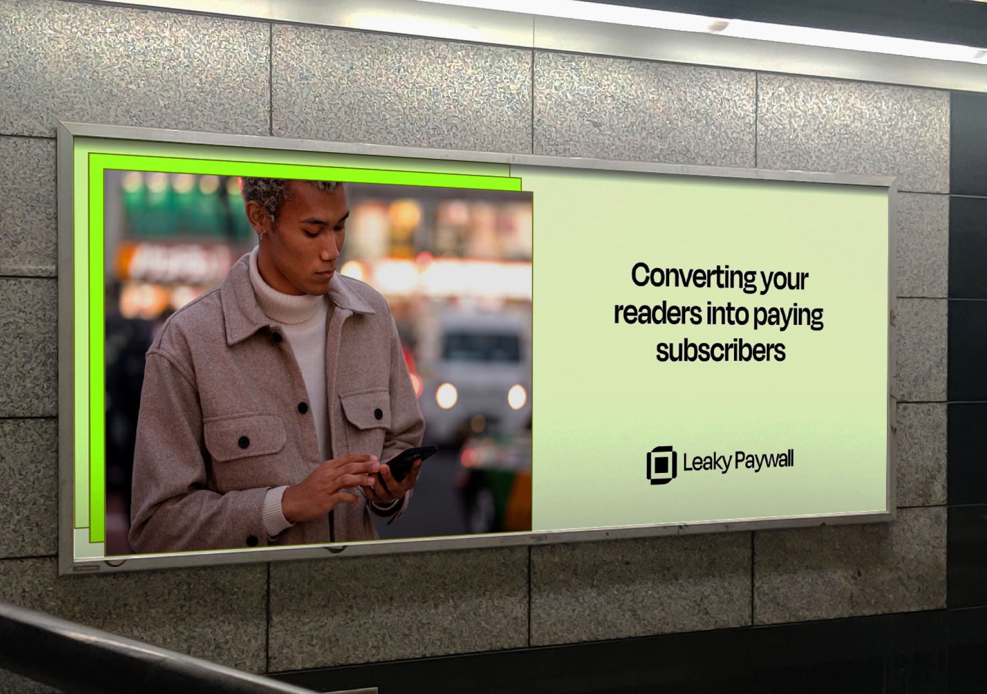
The three-layer concept became literal in the visual system. Stacked elements, layered photography, and overlapping design patterns reinforce Leaky Paywall's role as the connecting layer between publishers and readers. This system creates immediate visual recognition while communicating the platform's core value proposition.
The brand's visual treatment reflects how paywalls actually work: bringing valuable content into sharp focus. Blurred backgrounds and clear foreground elements mirror the reader's experience, and content becomes accessible and valuable upon engagement. This metaphor runs through every touchpoint, from website design to marketing materials.


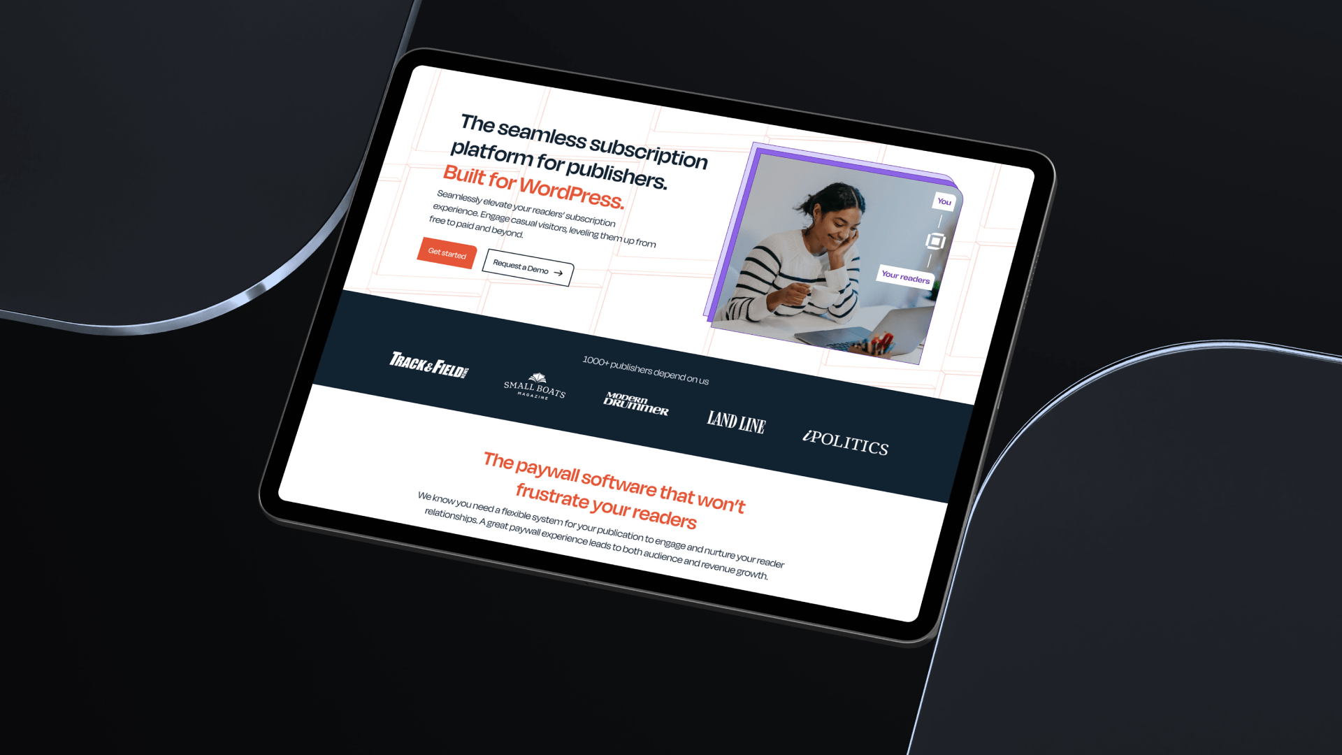
Extending the brand to digital platforms
The website positions Leaky Paywall as essential infrastructure for publishers serious about subscription revenue. Clear information architecture helps prospects understand both the platform's capabilities and its strategic value. The design emphasizes results over features, showing how the platform enables publishers to build sustainable businesses.
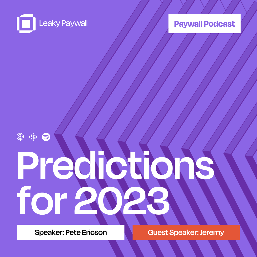
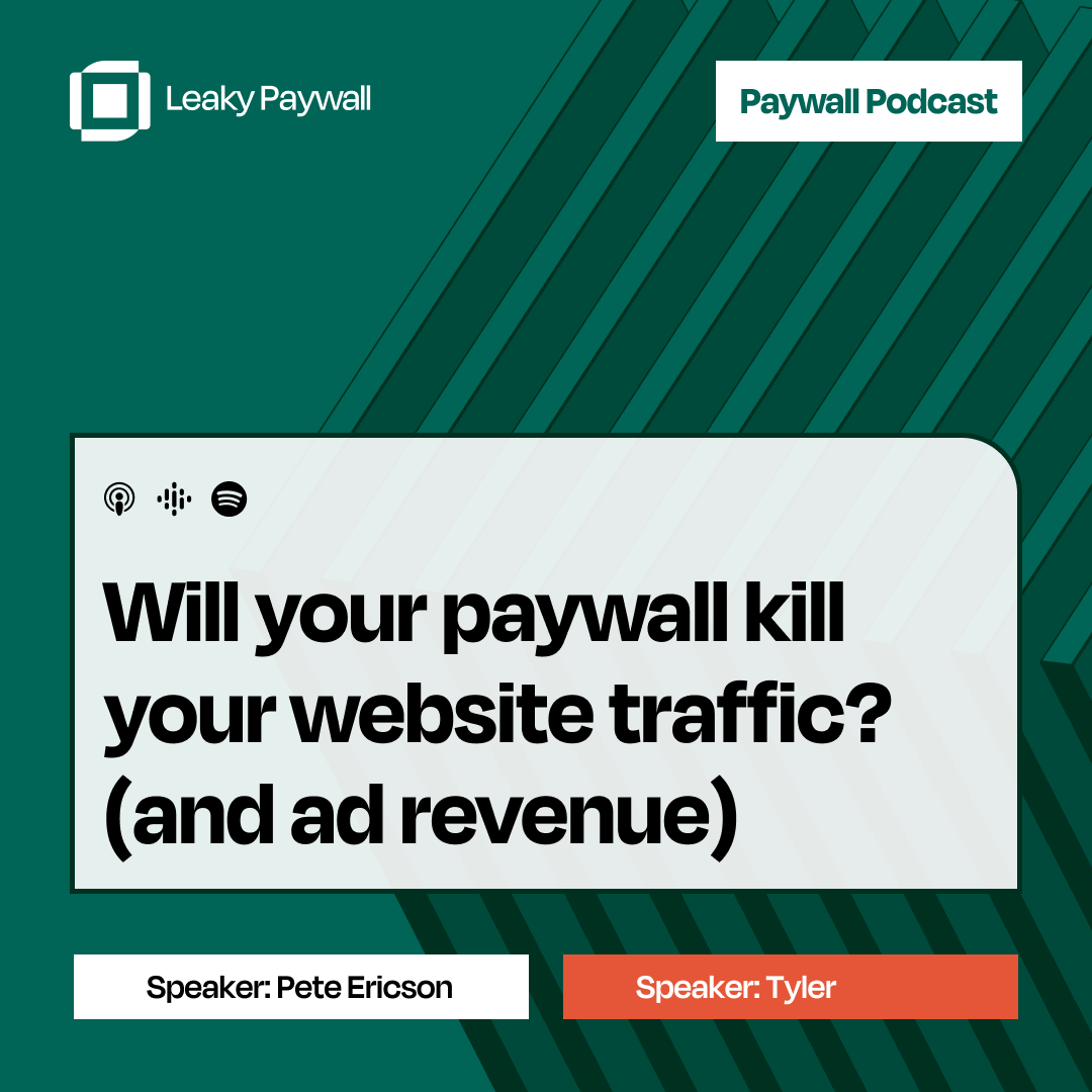
The company podcast extends the brand into content marketing, positioning Leaky Paywall's leadership as thought leaders in the subscription economy. Consistent visual treatment reinforces the brand while providing valuable insights to the publisher community.

Selected works

Mercurie

Hang