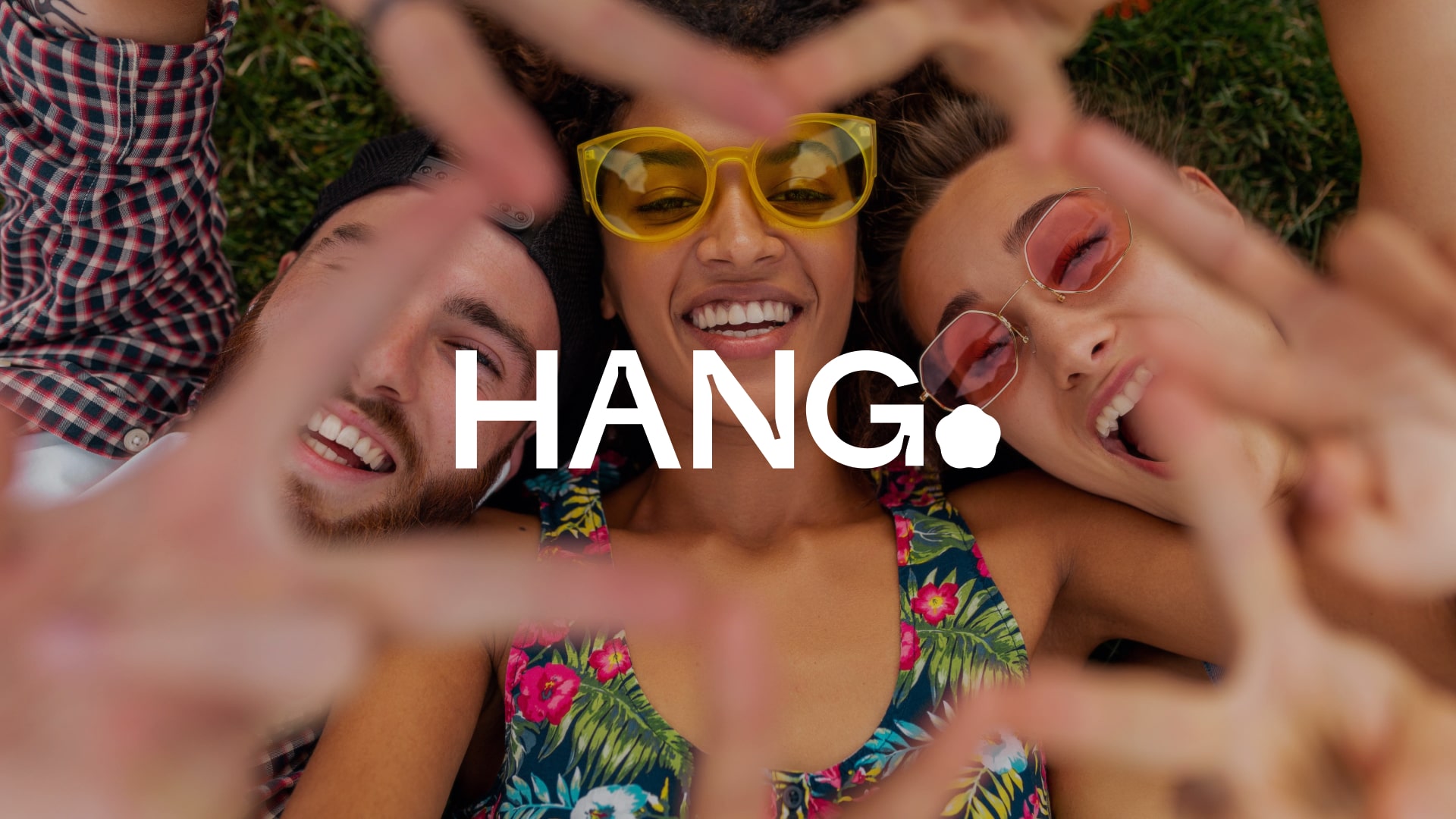
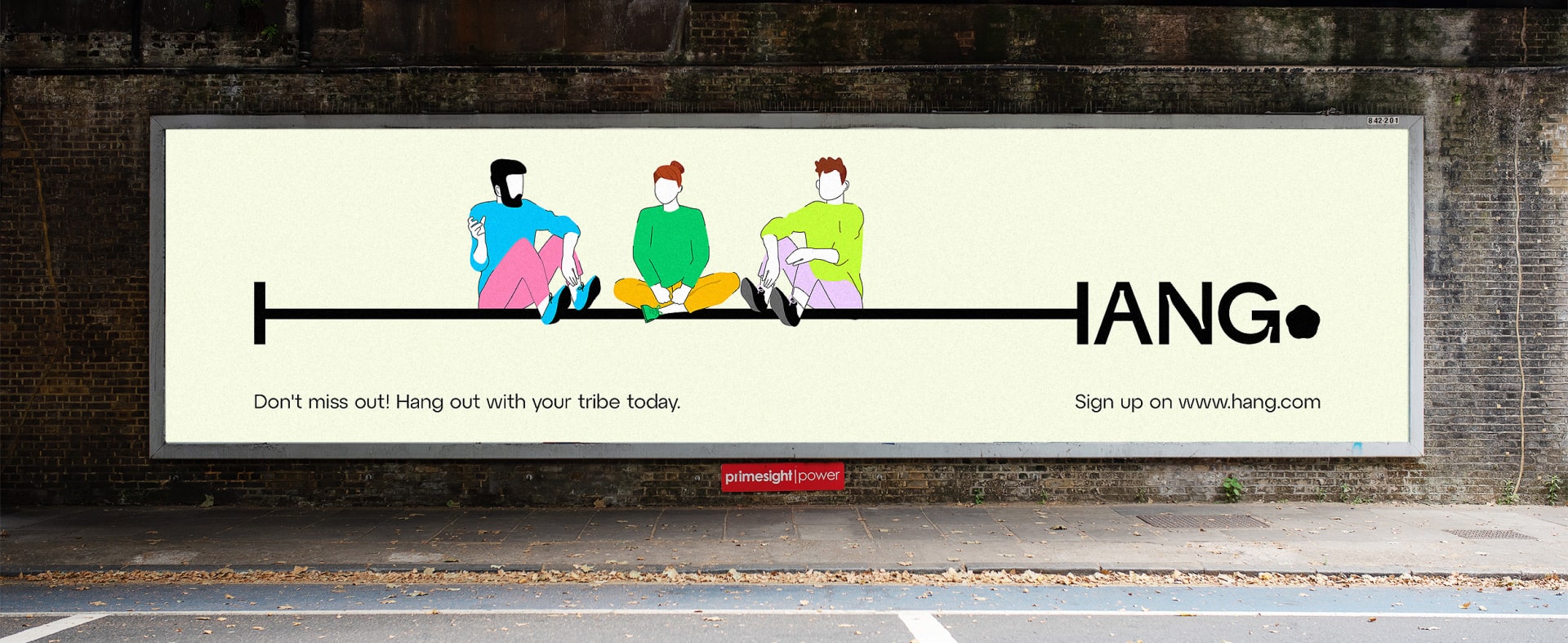
Hang

We're living through a loneliness epidemic. Despite being more "connected" than ever, people report feeling increasingly isolated. Social media promised community but delivered echo chambers. Dating apps promised relationships but created endless swiping. Meanwhile, real-world social infrastructure—community centers, third spaces, casual gathering spots—continued to disappear.
Hang saw an opportunity to reverse this trend. Not another digital-first platform, but a tool designed to get people offline and together. The vision was ambitious: create a platform that uses technology to eliminate the need for technology, connecting strangers around shared interests and transforming them into real-world communities.
But launching a platform about authentic connection requires authentic branding.
We helped them build an identity as diverse and dynamic as the communities they serve.
Strategy | Visual Identity
Motion Design | Illustrations
Product Design | Website Design
Creative Direction | Brand Design
Motion Design | Website Design
3D | Art Direction
Website Design
The insight that shaped everything: technology should be the bridge, not the destination. Hang isn't competing with social media, it's offering an alternative path entirely. While other platforms measure success in daily active users, Hang measures success in lasting friendships formed offline.
This philosophy required rethinking everything about social platform branding. Instead of addictive design patterns that keep users engaged, we needed to create a desire for real-world experiences. Instead of targeting specific demographics, we needed to appeal to the universal human need for authentic connection. The brand had to feel like an invitation, not an interruption.

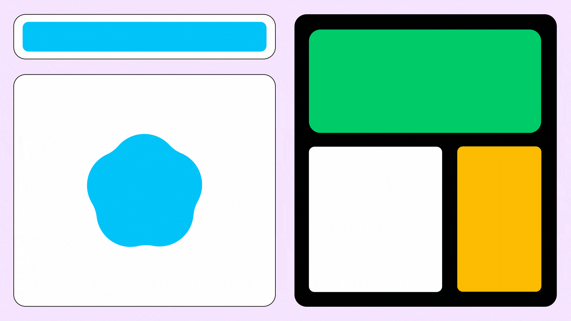
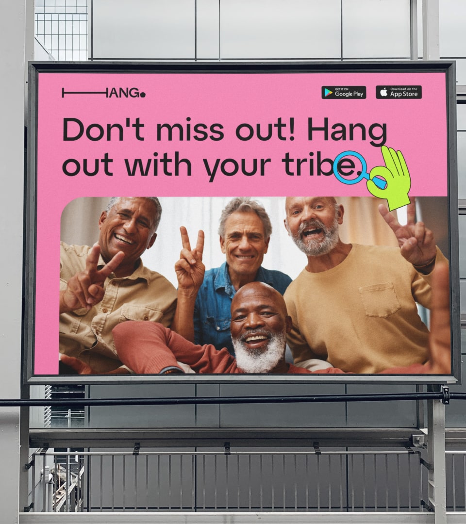
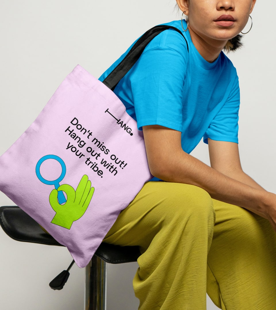
A spectrum of diversity
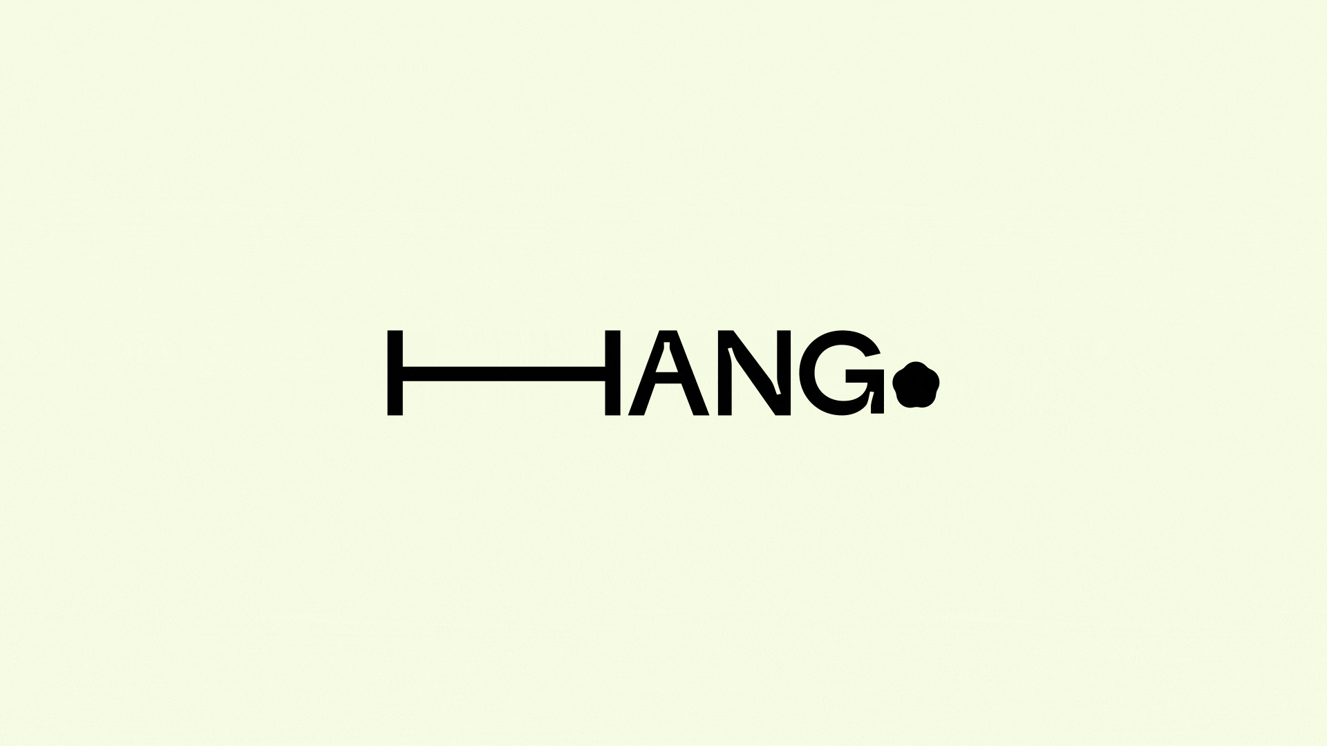
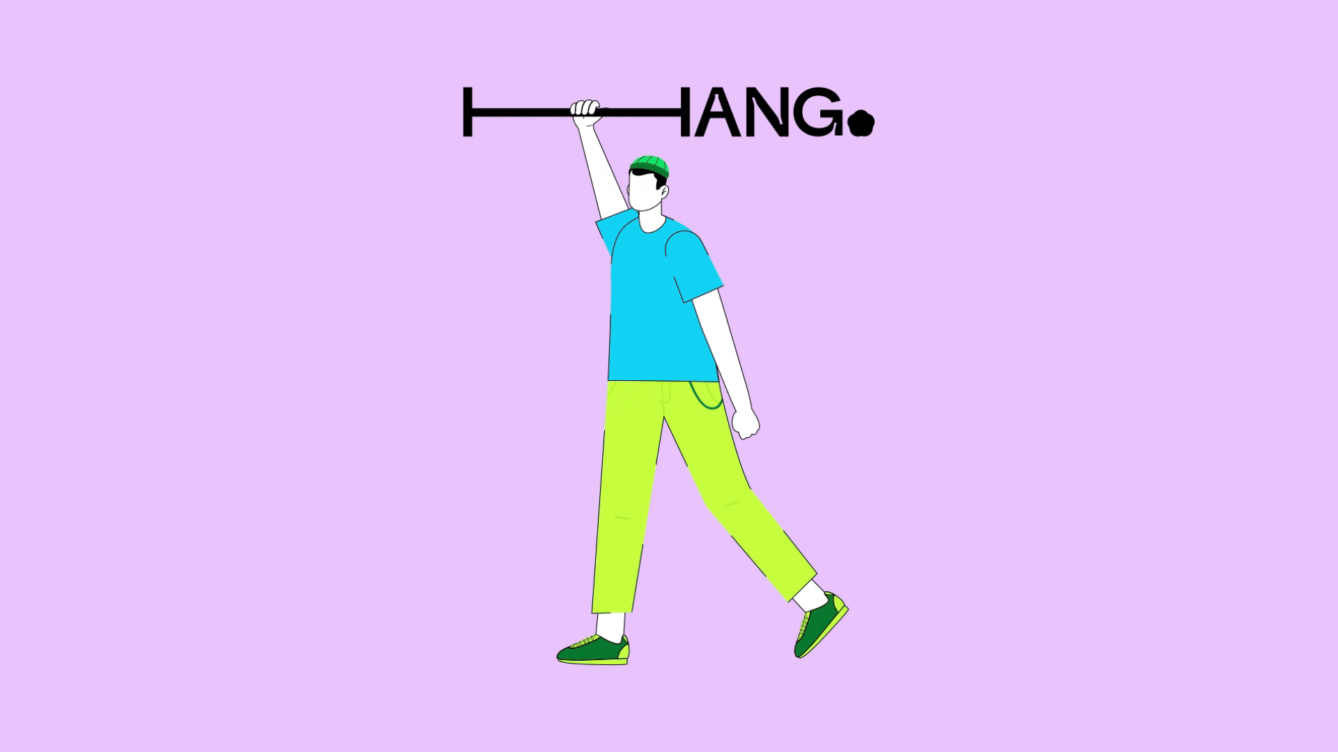
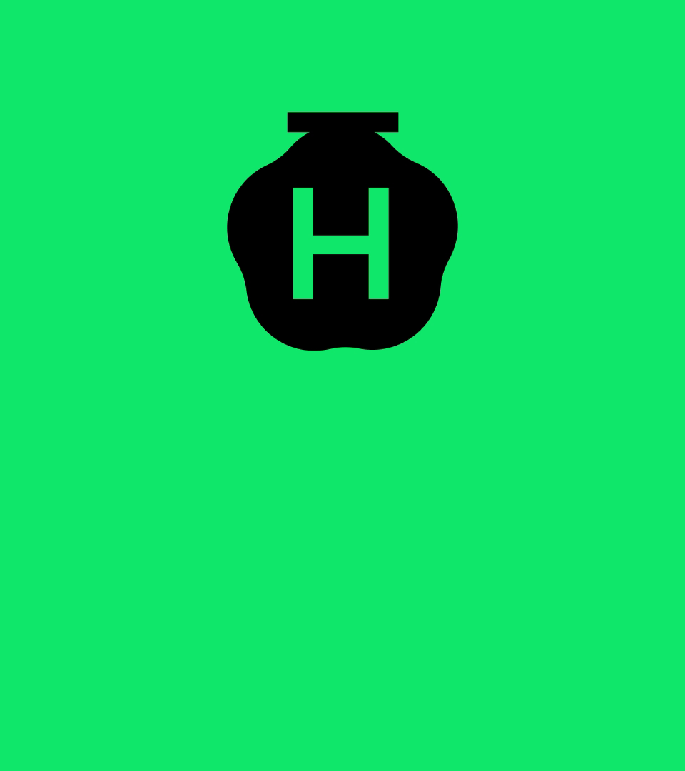
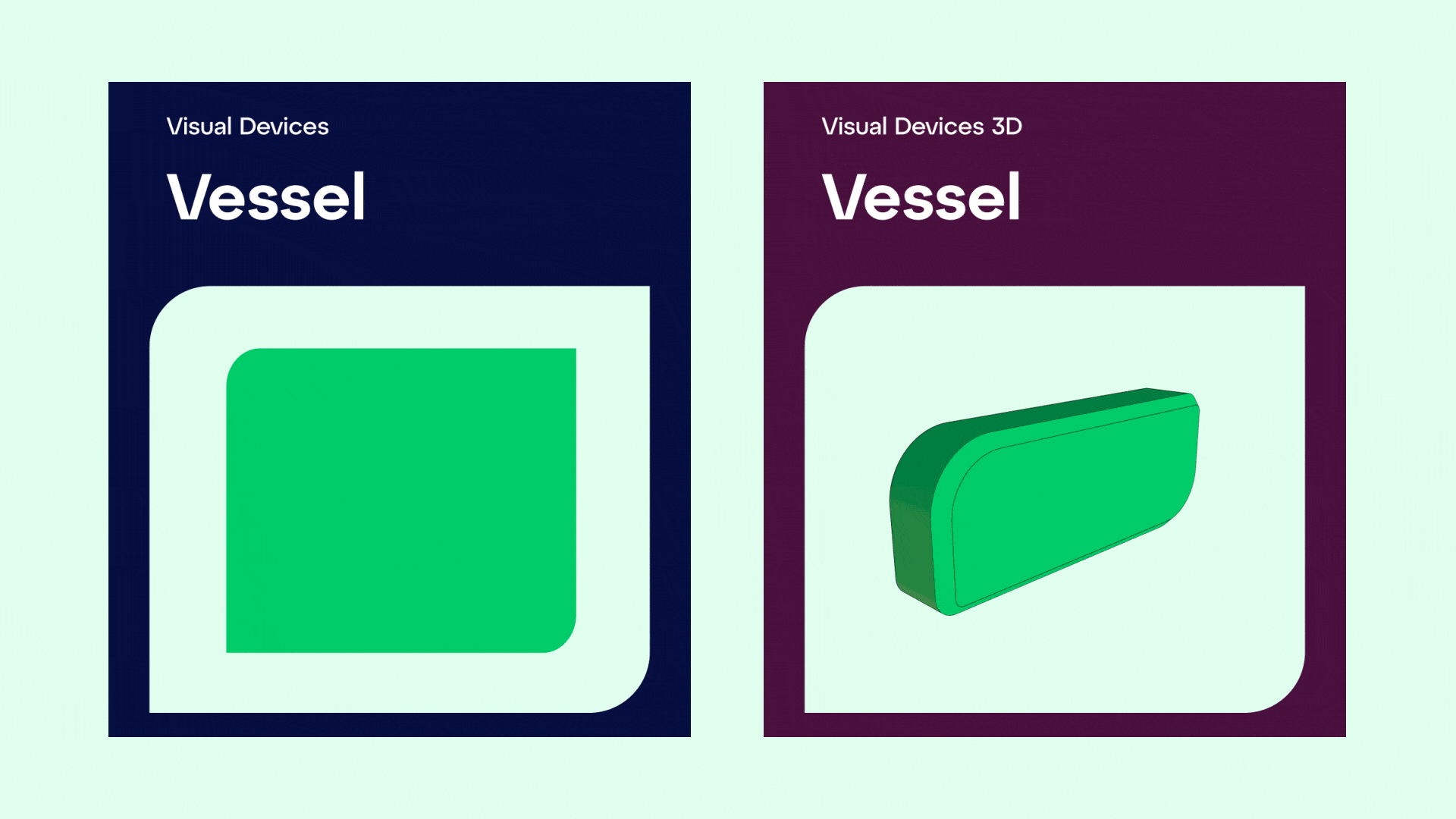
The logo's fluid, dynamic form sets the tone for Hang's entire visual approach. Rather than a static mark, it's a living symbol that can adapt to different contexts while maintaining recognition. This flexibility mirrors how real communities form and evolve; organically, authentically, without rigid structures.
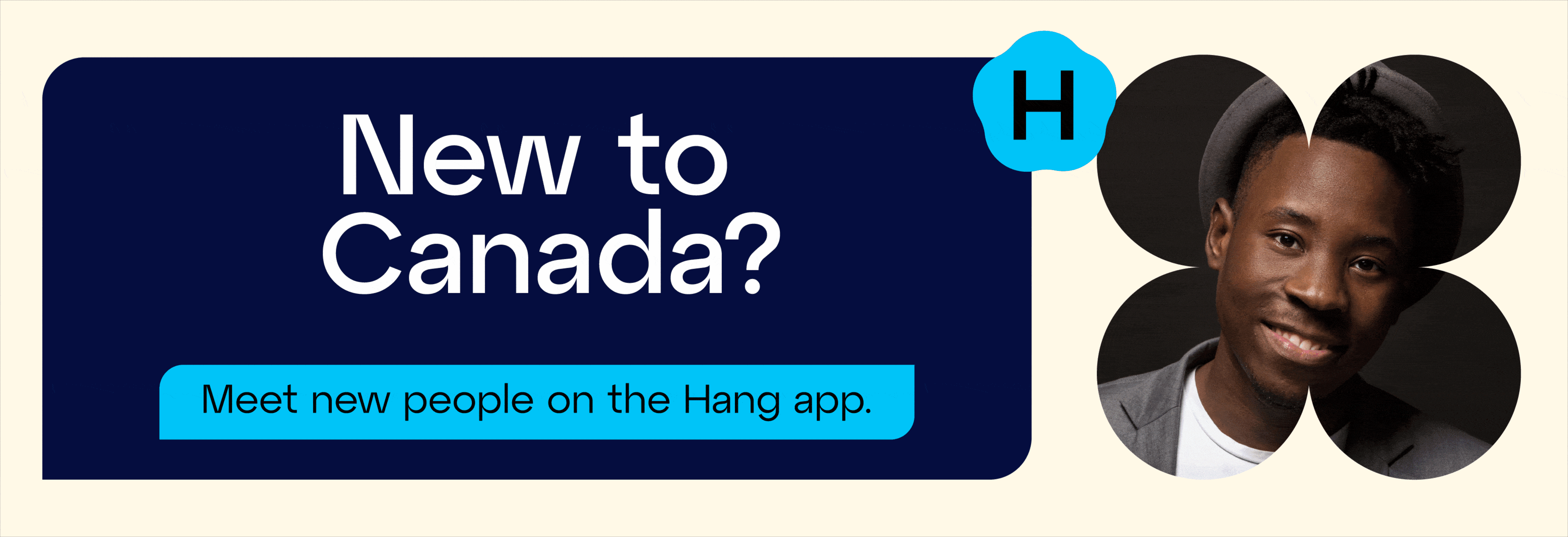
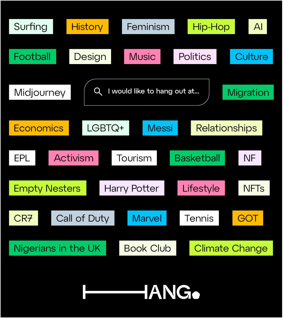
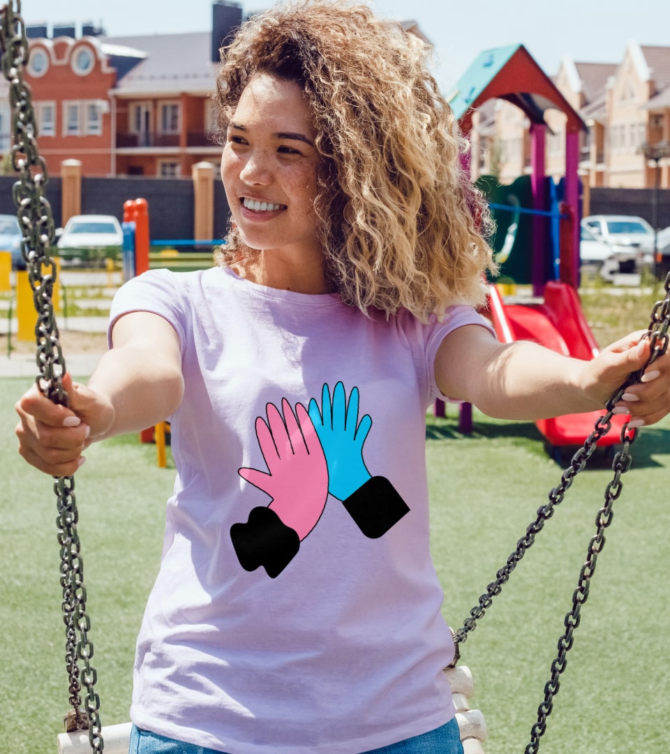
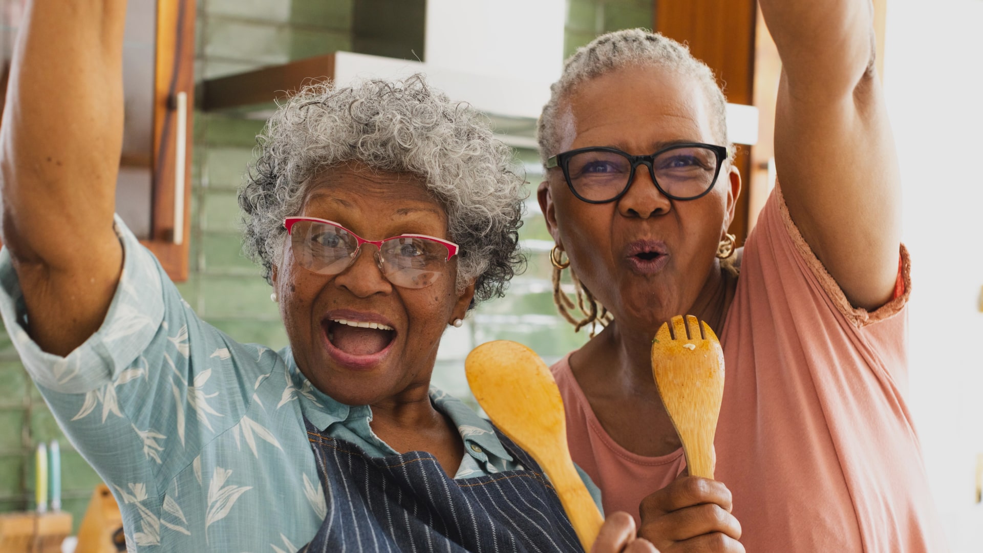
Hang caters to a diverse audience spanning generations and interests, and this inclusivity is reflected in its vibrant 15-color palette. With no single primary color, the system celebrates multiplicity over hierarchy. These colors enable unique expressions across different communities, allowing each group to find a visual representation that feels authentic to their identity.
The palette works strategically: book clubs might gravitate toward warmer tones, while tech meetups prefer cooler blues and greens. The system provides options without imposing limitations.
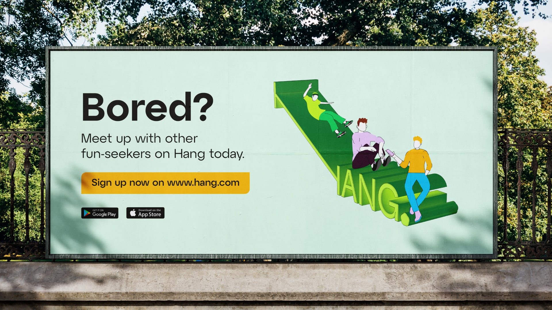
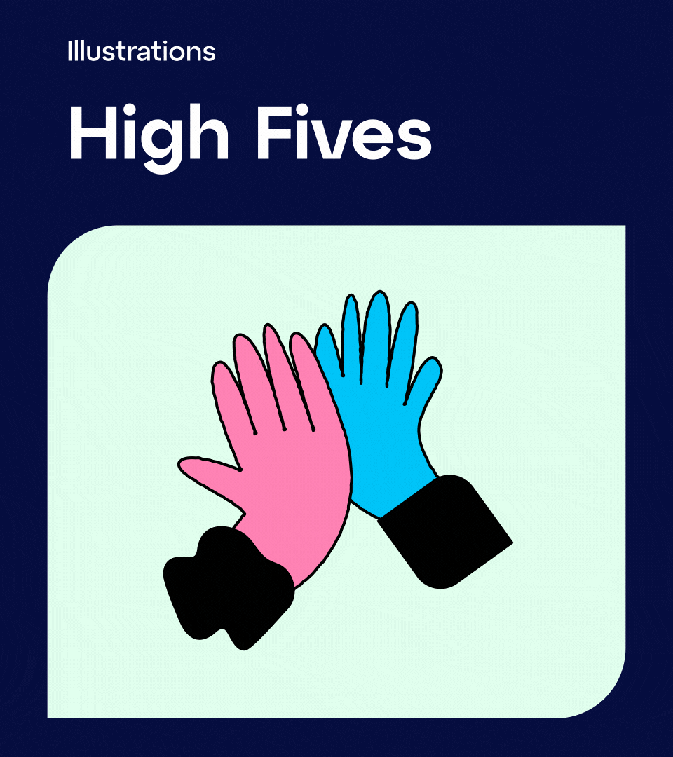
Custom illustrations featuring various shapes and forms emphasize diversity and inclusion at every touchpoint. These aren't decorative elements, they're strategic tools that help different people see themselves represented in the Hang community.
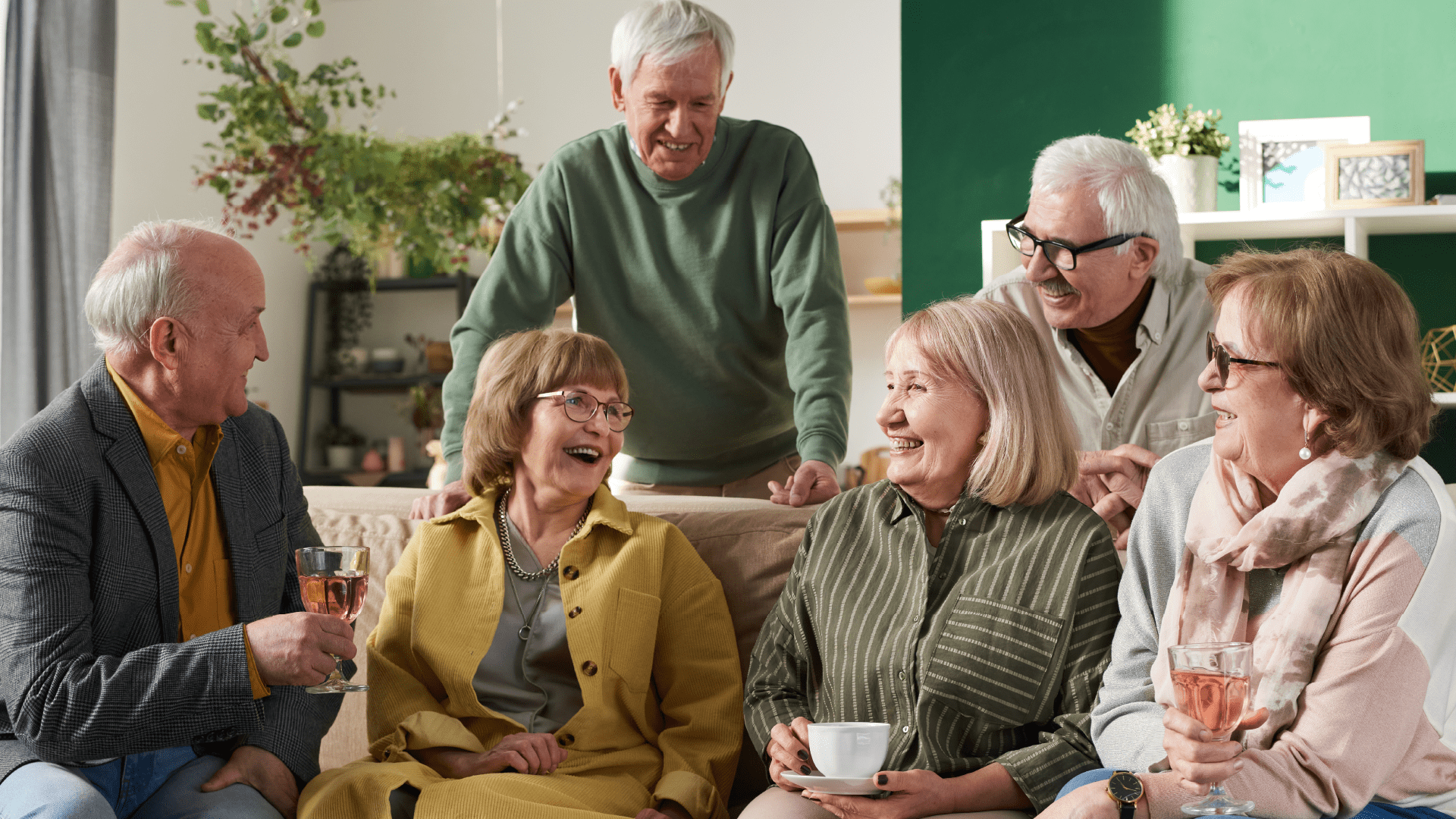

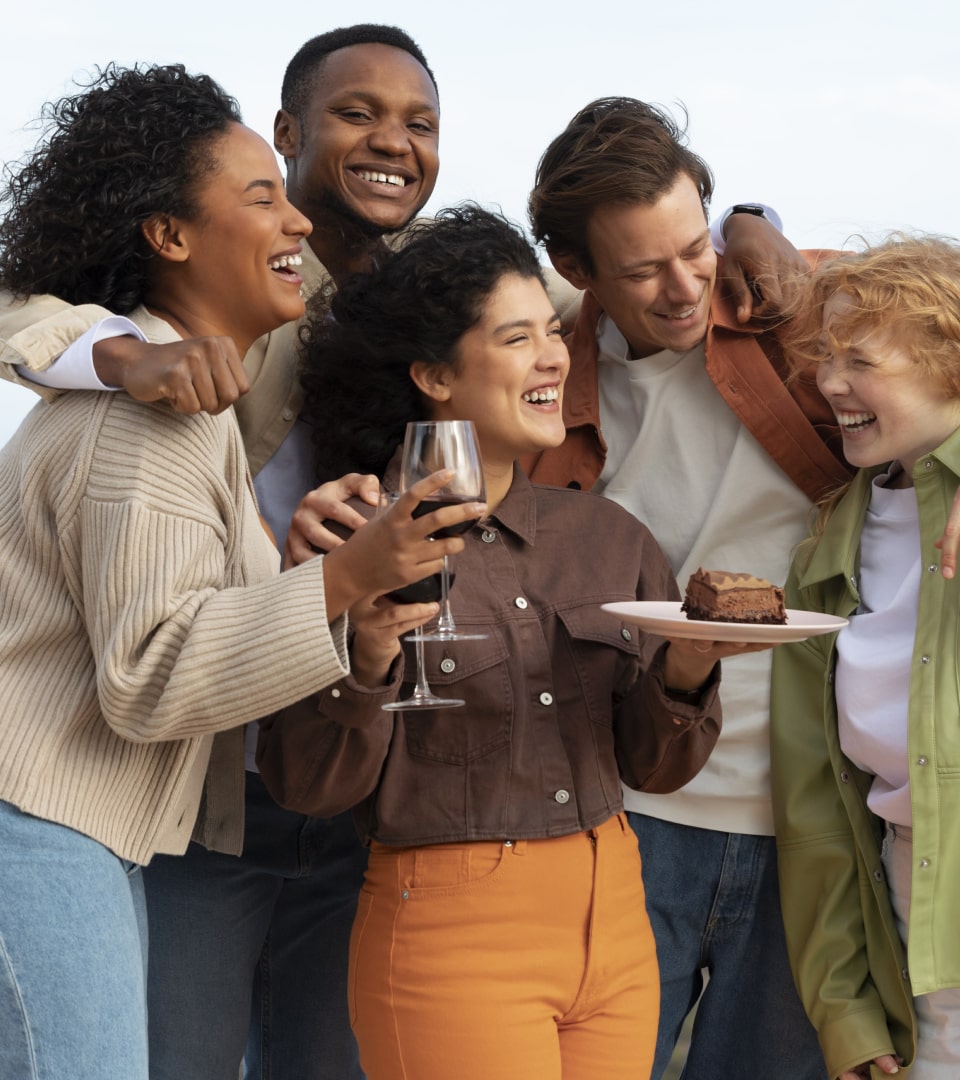
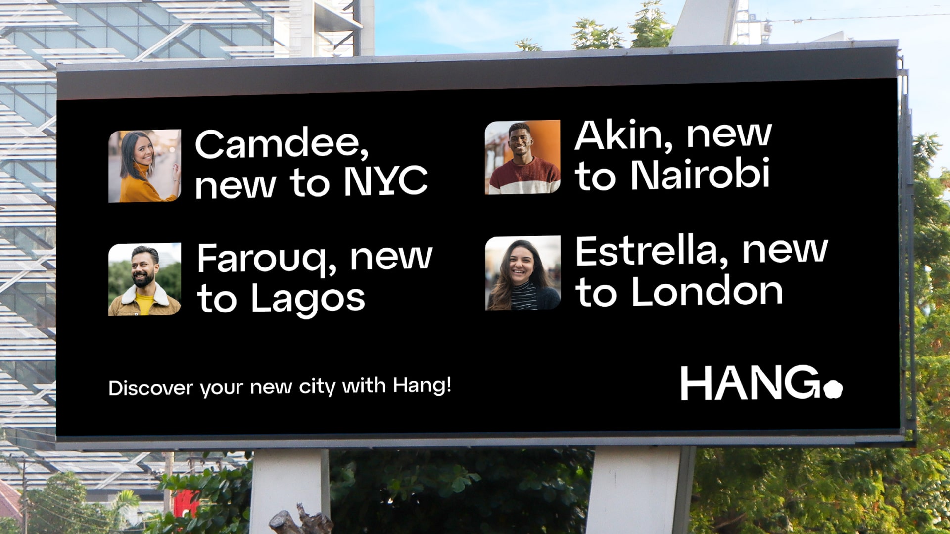
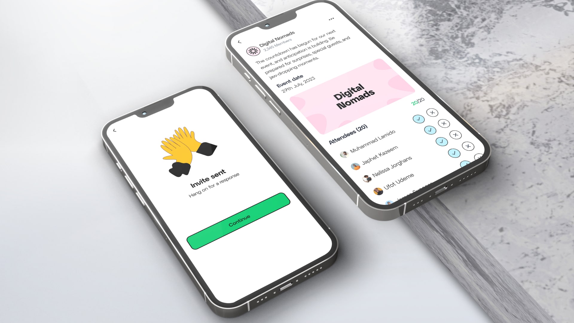
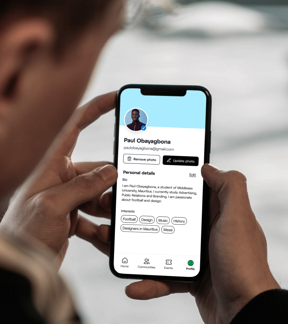
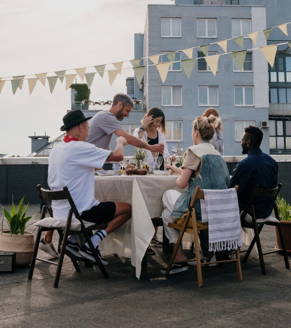
Designed for real-world connections
The website and app prioritize showcasing Hang's diverse user base, demonstrating the platform's ability to connect people from all backgrounds. Critically, online interaction is intentionally limited to event-specific discussions within established communities, ensuring digital sparks translate into meaningful physical experiences.
The user experience deliberately creates friction around endless browsing while removing friction from event discovery and attendance. Every design decision asks: Does this encourage real-world connection?


Created to foster social interaction
The complete brand system operates like the communities it serves—flexible, inclusive, and designed to grow organically. Visual devices can be mixed, matched, and adapted as new communities join the platform, ensuring the brand evolves alongside its users.


Selected works
Humanio
Agora
