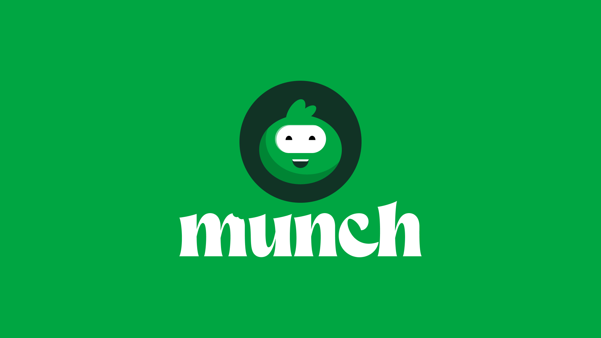
Munch
The UK food delivery market was dominated by platforms that prioritized scale over story. Major players focused on quick delivery times and broad restaurant coverage, but failed to address a fundamental gap: representation. Black, Asian, and Minority Ethnic (BAME) owned restaurants, despite serving some of the country's most beloved cuisines, struggled for visibility against corporate chains with larger marketing budgets.
Meanwhile, diverse communities across the UK craved authentic flavors from home but found themselves scrolling through endless lists of generic options. The platforms that promised "everything" delivered convenience but rarely delivered connection to cultural identity and authentic experiences.
Munch saw this as more than a market opportunity; it was a mission. By building a platform that prioritizes unrepresented founders and authentic cuisine, they could simultaneously support BAME-owned businesses and help communities access the flavors that matter most to them.
We helped them build a brand that celebrates this diversity.
Brand Identity | Motion Design
Illustrations | Iconography
Brand Guidelines | Pitch Deck
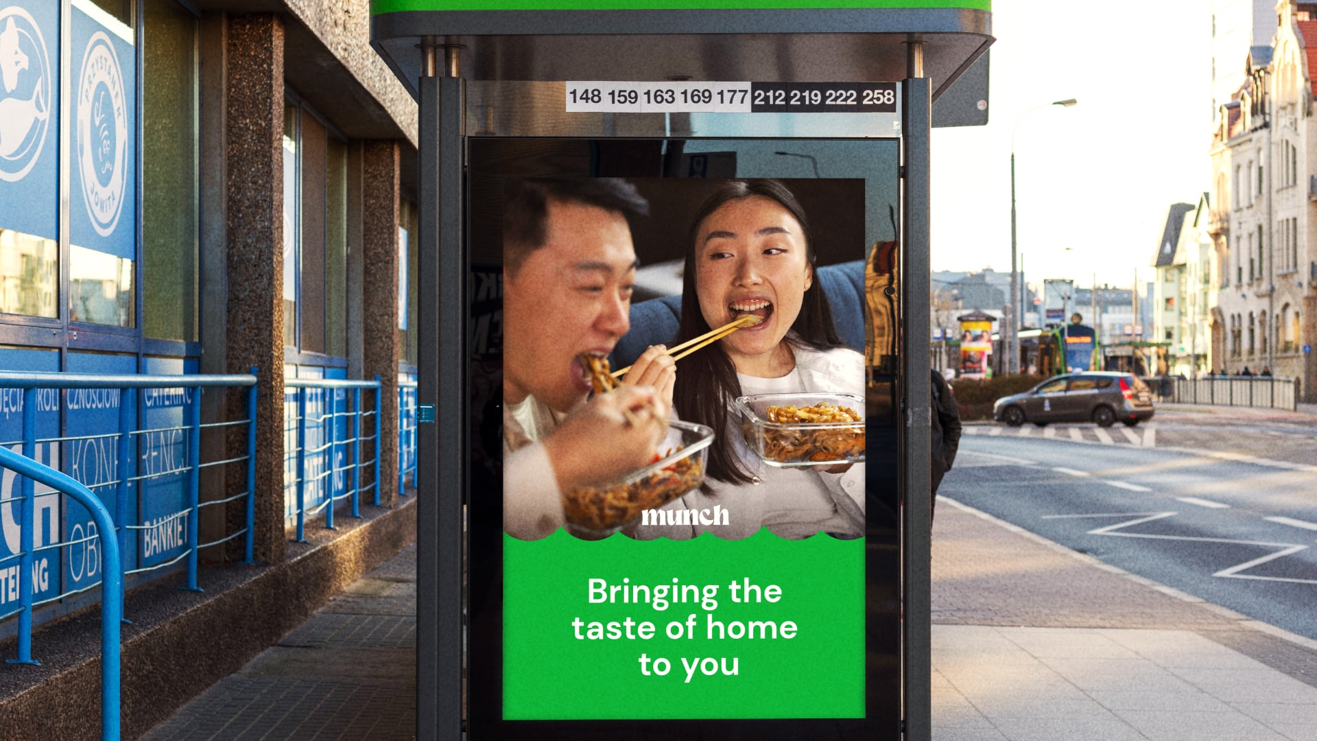
Bringing the taste of home to you
The insight that shaped everything: authentic food creates connection that transcends cultural boundaries. Munch doesn't just deliver meals, they deliver memories, traditions, and the comfort of familiar flavors. Whether you're a second-generation immigrant craving your grandmother's recipes or a curious food lover eager to explore new cuisines, Munch provides access to authentic experiences.
This philosophy recognizes that food is cultural currency. When BAME-owned restaurants thrive, they preserve traditions, create jobs in their communities, and introduce new flavors to the broader food landscape. Munch becomes the platform that makes this cultural exchange possible, turning every meal into an opportunity for discovery and connection.
A platform for everyone
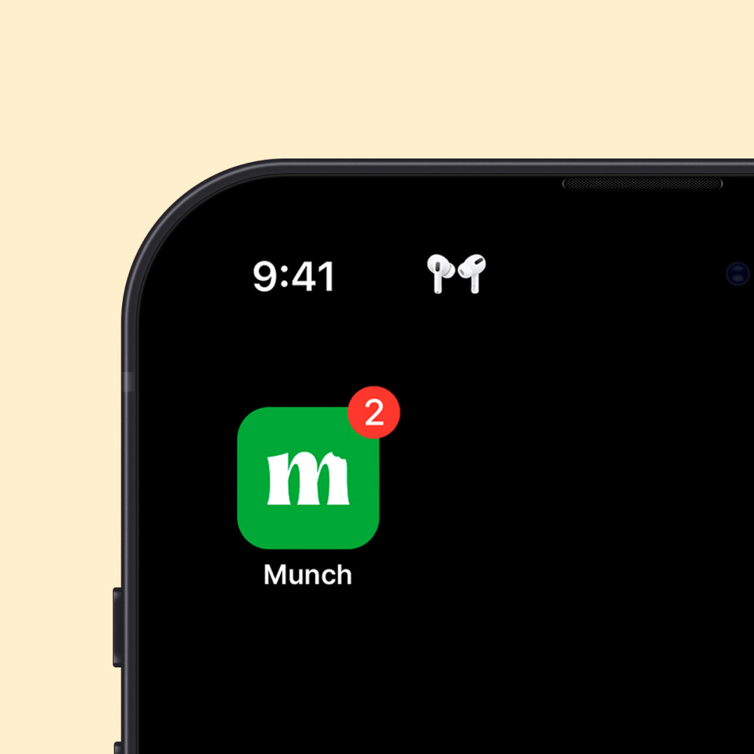
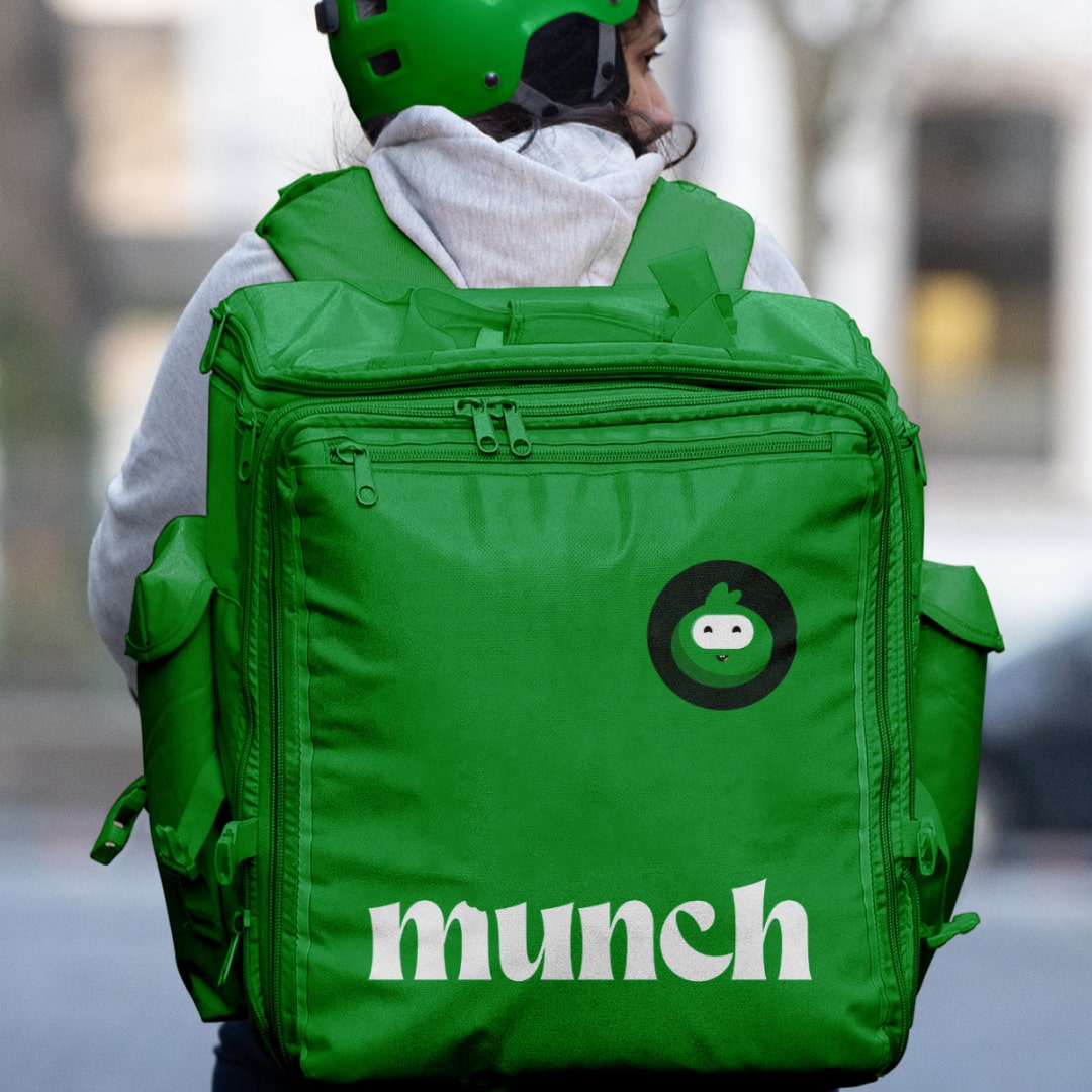
The logo centers on a bold "M" with a distinctive bite mark from Munchy, the brand mascot. This playful detail transforms a simple lettermark into something with character and story, essential for a brand that needs to feel approachable rather than corporate. The bitten "M" creates movement and memorability while reinforcing the core action: munching on great food.
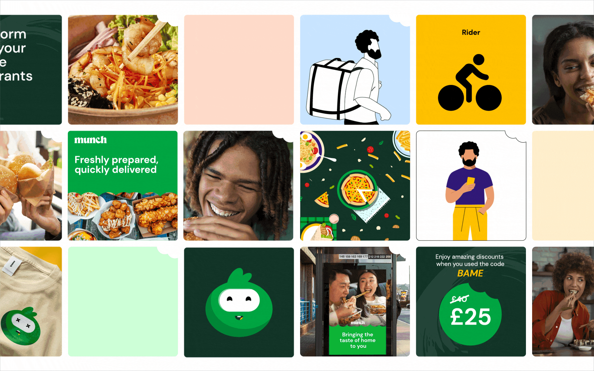
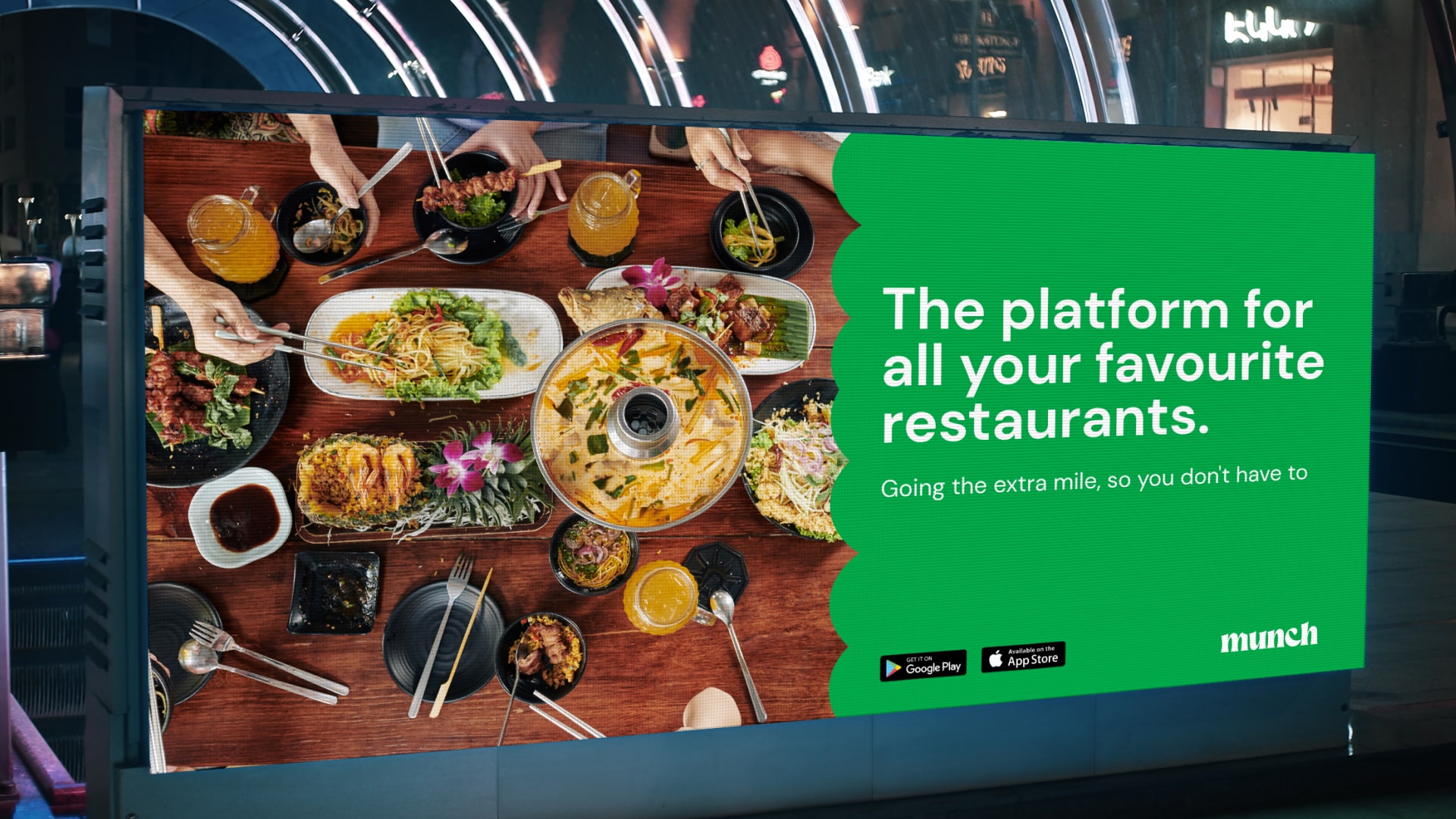
The vibrant palette draws inspiration from words related to eating, with each color named after synonyms for consumption. "Munch" serves as the primary color. This naming system reinforces the food-centric brand while creating a memorable, ownable color language. The warm, diverse palette visually represents both the variety of cuisines and the communities Munch serves.


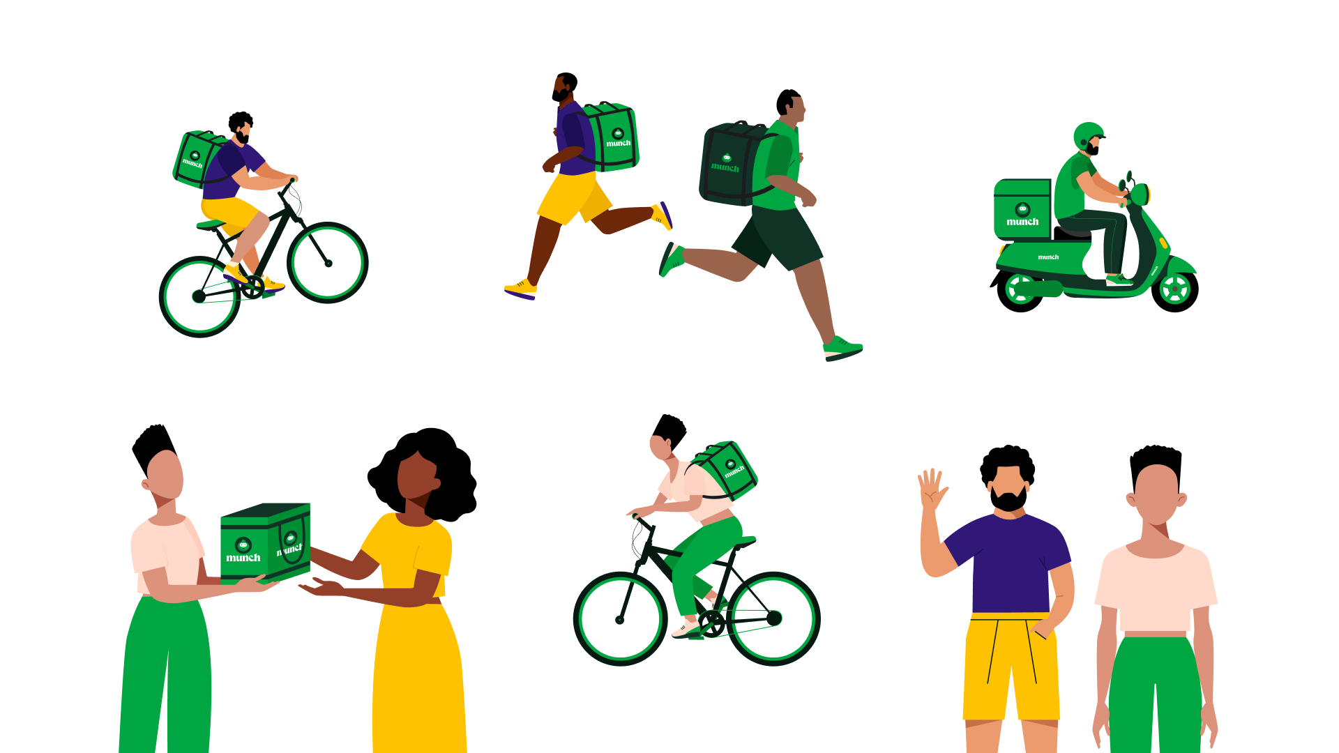
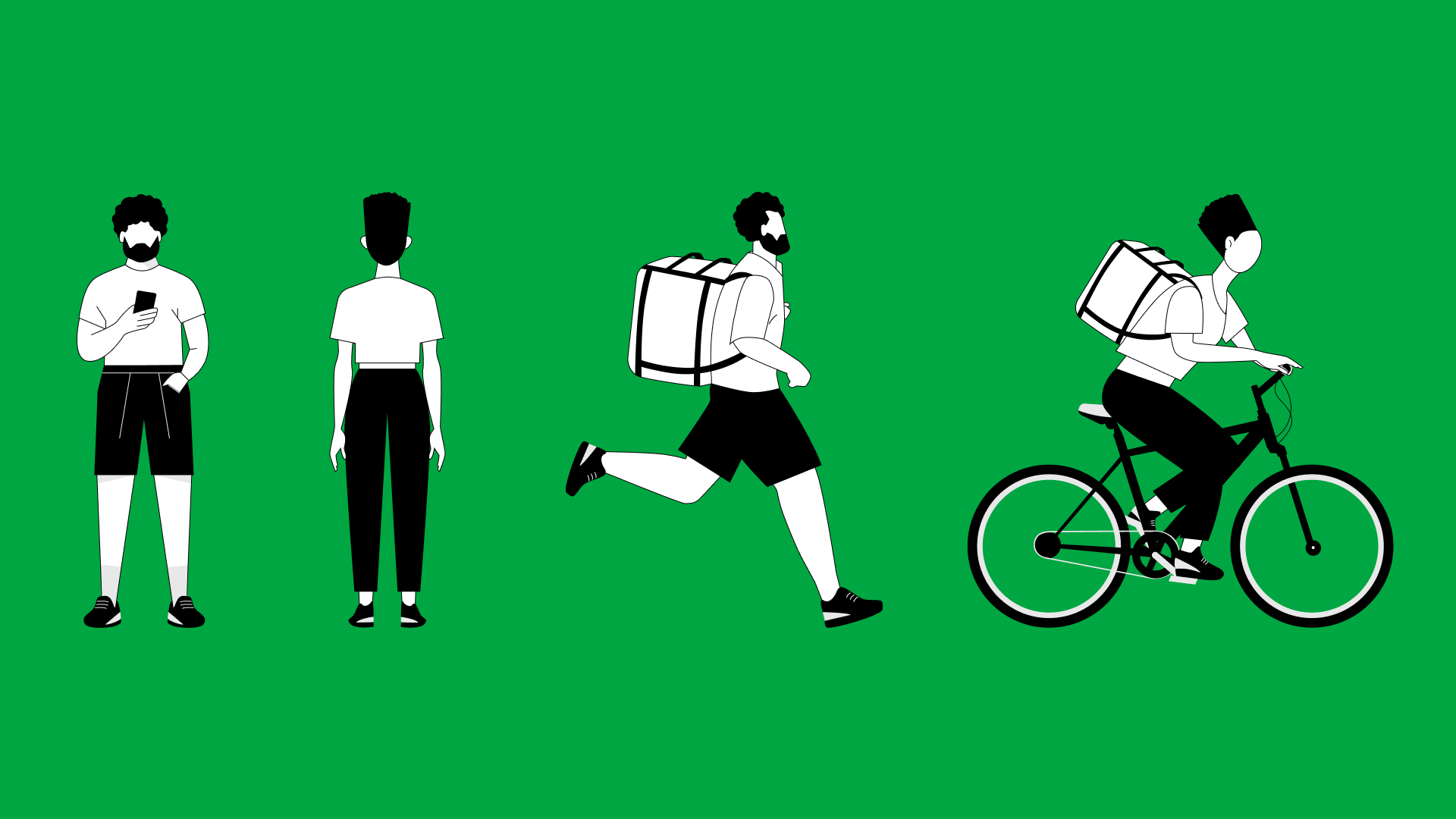
Flexible character system
Custom character illustrations were built for adaptability and representation. By creating modular components—interchangeable head profiles, varied skin tones, and adjustable features—new characters can be quickly generated while maintaining consistency. This system ensures Munch can represent diverse communities without relying on generic stock illustrations.
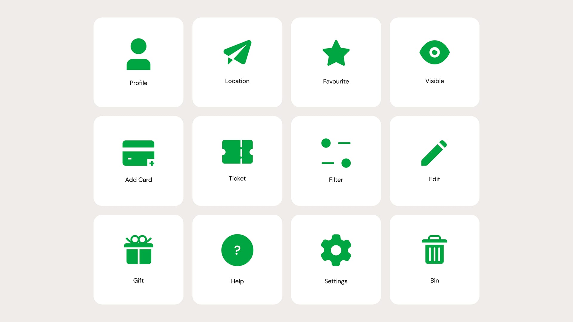
A custom icon set enhances in-app navigation with symbols that are simple, intuitive, and culturally inclusive. Each icon follows the brand's playful yet professional aesthetic, ensuring the interface feels welcoming while maintaining functionality across diverse user groups.

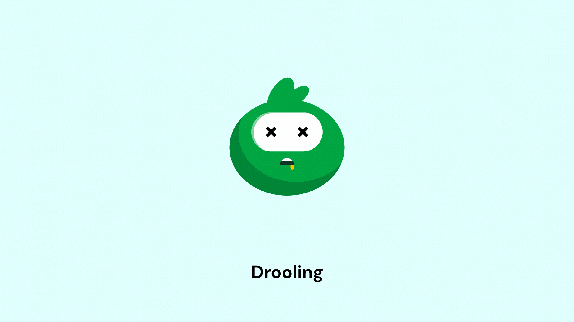
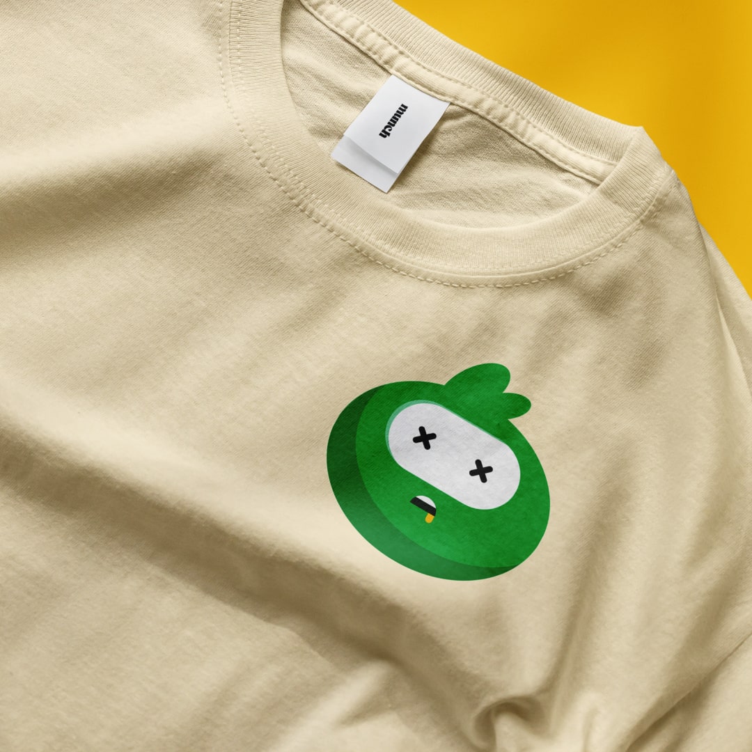
Meet Munchy: the feel-good mascot
Munchy serves as Munch's emotional connector, bringing warmth and personality to every brand touchpoint. Whether appearing in-app, on marketing materials, or during campaigns, Munchy embodies the joy of food discovery and creates memorable moments that distinguish Munch from sterile delivery platforms.

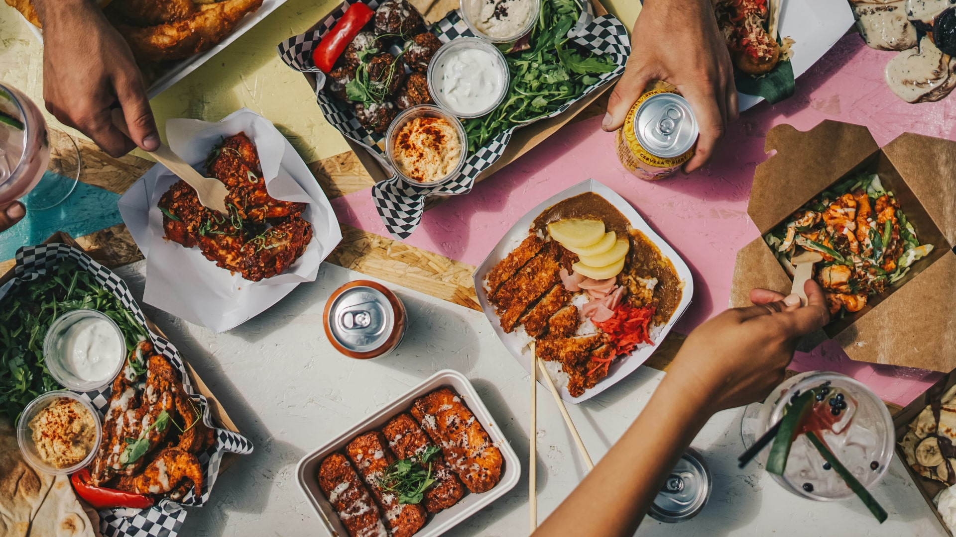
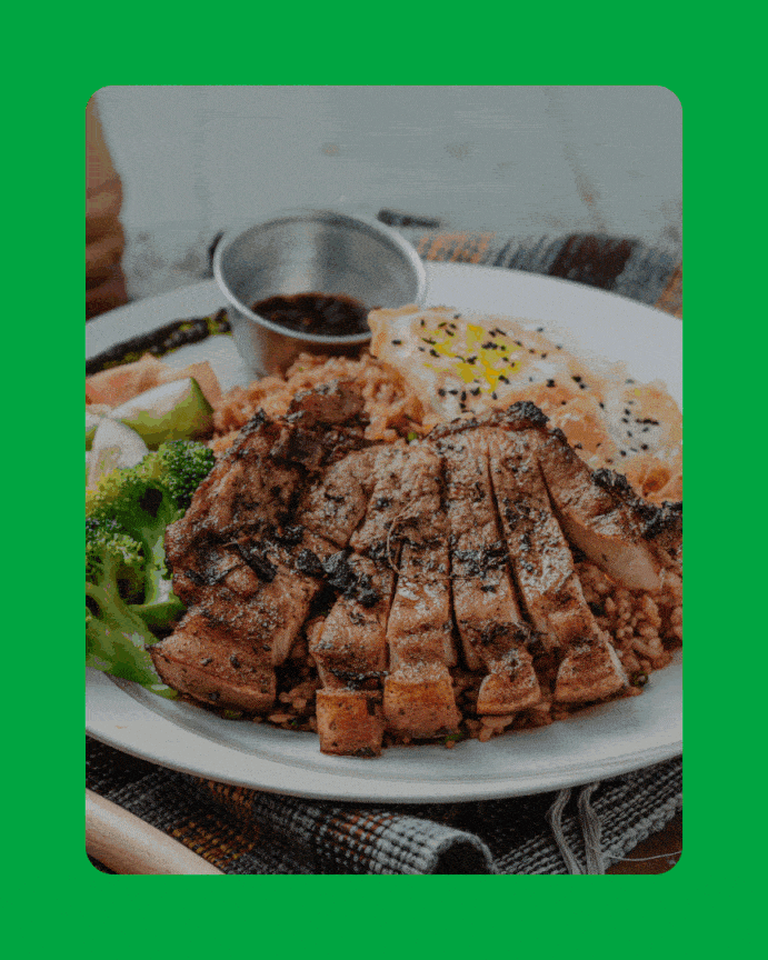
Photography that captures connection
The visual strategy emphasizes authentic moments, people enjoying food alone and together, candid shots that show genuine enjoyment rather than staged perfection. This photography approach reinforces Munch's positioning as a platform that understands food culture and community connection.

Selected works

Mercurie

Hang